Last Updated on December 17, 2025 by Masha Eretnova
Red and green are situated on the opposite sides of the color wheel – they are complementary colors.
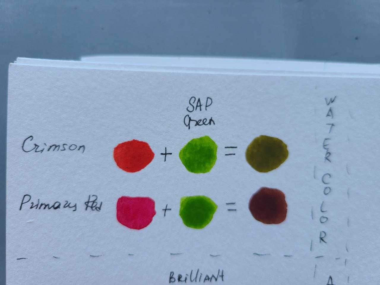
I tested different red and green colors to show you what colors they create when mixed in different ratios.
When you mix red and green paint you can get brown, black, or olive.
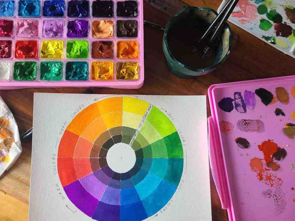
Red and Green on the color wheel
In color theory, red is considered a primary color and is located on the outermost edge of the color wheel. It is opposite to green on the color wheel and they are complementary colors.
When used in color combinations, it can create a wide range of colors:
- combined with yellow, it creates the color orange,
- combined with blue, it creates the color purple,
- combined with black, it creates shades of maroon and burgundy.
In terms of color psychology and meaning, red is considered a strong color that can evoke feelings of passion, love, and energy.
It is also associated with danger and warning. Red can be used to create excitement and urgency in design and art, but it’s important to use it in the right amounts, as too much can be overwhelming.
There are many different shades of red that artists use, but some of the most common include:
- Cadmium Red: This is a warm, bright red that is often used in painting for landscapes and still lives. This is the most common red paint color we use.
- Alizarin Crimson: This is a cool, dark red color.
- Vermilion: This is a warm, orange-red color that is often used in painting for sunsets and other warm-toned scenes.
- Scarlet: This is a bright, warm red that is often used for abstract and expressionist paintings.
In color theory, green is considered a secondary color, which is created by mixing the primary colors blue and yellow.
It is located on the color wheel between blue and yellow and is considered the complementary color of red.
There are many different shades of green that artists use, but some of the most common include:
- Viridian: a cool, dark green.
- Sap Green: a warm, earthy green.
- Hooker’s Green: a warm, dark green.
- Olive: a warm, gray-green color .
- Chartreuse: a bright, yellow-green color.
- Mint: a cool, pale green color.
- Emerald green: a bright, cool green with a slightly blue undertone.
In terms of color psychology, green is often associated with nature, growth, and renewal. It is also associated with balance, harmony, and stability.
When combined with other colors, green produces:
- combined with red, it creates the color olive or brown.
- combined with blue, it creates the color teal or brown
- combined with black or brown, it creates shades of forest green and hunter green.
In art, green is widely used in landscapes, nature, and plant-life paintings.
Learn more about color theory: How To Mix Paint? – Your Complete Color Mixing Guide
What Does Red and Green Make Mixed? Texting Different Colors
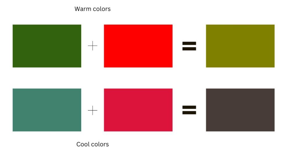
Mixed colors red and green make olive. Mixed cool red (ex., Crimson) and cool green (ex., Viridian) make a neutral color known as gray or a very dark brown.
For example, if you mix a warm red like Cadmium Red Light with a warm green like Sap Green, the resulting color will be a muted brown.

But if you mix a warm red like Vermilion with a warm green like Olive Green, the resulting color will be a muted gray.
If you mix red and green acrylic paint you can get the brown color to dark grey, almost black color.
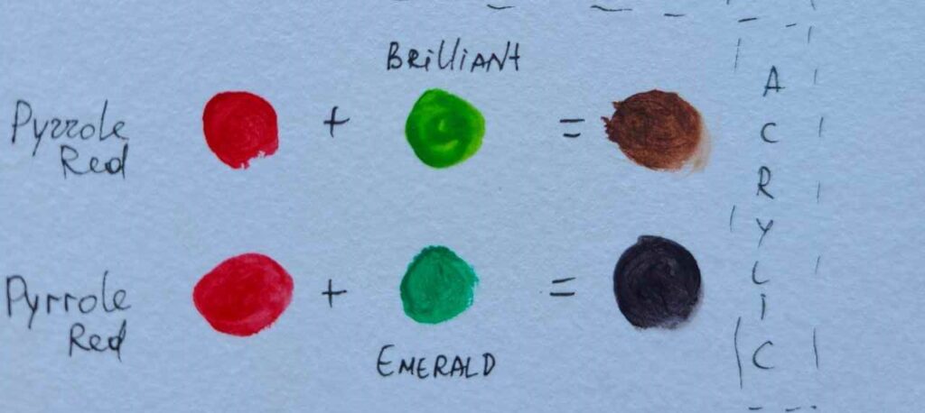
When mixing a blue-green (with a blue undertone) with red paint, it will create a brownish color.
The green undertone will neutralize some of the red’s natural warmth, and the blue will add a coolness to the mixture.
Too much blue with red will make more of a purple color.
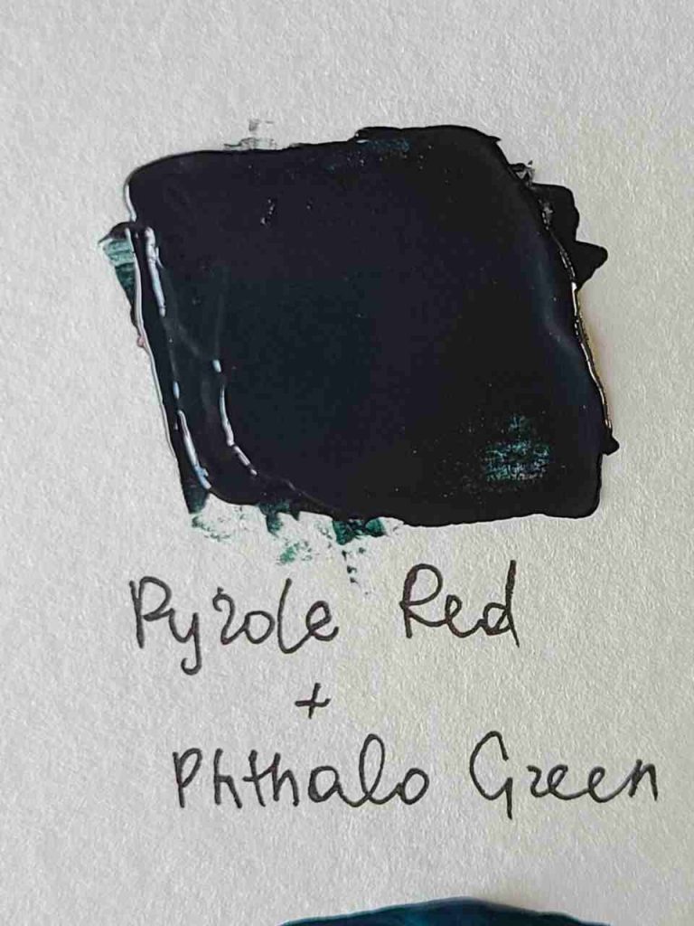
When you mix complementary colors together, their brightness and chroma (purity of color) will decrease, resulting in a more muted, subdued color.
Since cool red and cool green is already muted shades of their respective colors, when mixed together, the resulting color will be a very dark, muted gray or brown.
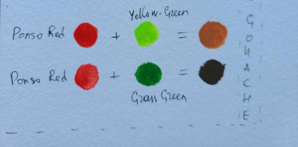
Mixing yellow-green with warm red will result in a light brown shade while mixing red with grass green will make a dark brown color.
When we mix red with white we can create pink which also mixes well with green and produces different shades: What Color Does Pink And Green Make? Color Mixing Guide
More mixing with green and red:
Brown color Use and Meaning
Brown is a neutral color that is created by mixing together different variations of red, yellow, and blue or any pair of complementary colors.
It is often associated with warmth, comfort, and stability.
There are many different shades of brown, each with its own unique characteristics.
For example, beige is a light, warm brown that is often associated with sand and natural fibers. Sienna is a warm, earthy brown that is often used in oil paintings to create the illusion of depth and texture.
More shades of brown:
- Burnt Sienna: A warm, earthy brown with a reddish undertone. It is often used in oil paintings to create the illusion of depth and texture.
- Raw Sienna is a warm, earthy brown color with a yellow undertone.
- Burnt Umber: A dark, warm brown with a reddish undertone. It is often used to create the illusion of shadows and depth in paintings.
- Raw Umber: A cool, grayish brown with a green undertone. It is often used to create the illusion of natural materials like wood, stone, and soil.
- Van Dyke Brown: A cool, dark brown with a green undertone. It is often used to create the illusion of depth and texture in paintings.
- Sepia: A warm, reddish-brown with a yellow undertone. It is often used to create the illusion of age and nostalgia in paintings and photographs.
Brown is often used as a background color or as a neutral color in a painting or design. It is also often used to create the illusion of natural materials like wood, stone, and soil.
It’s worth noting that brown can also be seen as a dark version of orange or yellow, depending on the undertones of the brown shade, and it can also be perceived as warm or cool depending on the context and the colors it’s paired with.
How to Use Red, Green and Brown in Painting or Drawing
Red and green are often used together in painting and drawing as they are complementary colors on the color wheel.
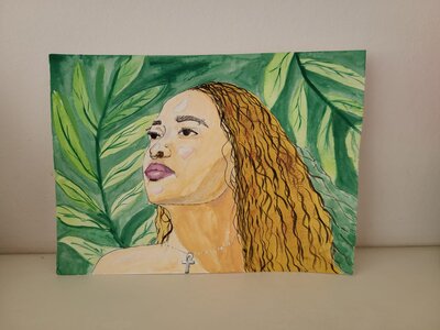
Here are a few ways to use red and green together in painting and drawing:
- Contrast: One way to use red and green together is to create contrast between the two colors. For example, using a bright red against a dark green background can create a striking visual contrast.
- Color Blocking: Another way to use red and green together is to use color blocking. This can be done by creating large blocks of color in different shades of red and green to create a sense of harmony.
- Underpainting: Using green as an underpainting for a red object can create depth and interest to the final painting, as the green will show through the layers of red and create a sense of dimension. If you are using warm red, choose cool green for underpainting.
- Portraiture: In portraiture, red and green can be used to create a sense of mood and atmosphere, for example, using a cool green to create a calm feeling or a warm red to create a feeling of passion.
How to use brown in painting and drawing
- Sketching: Brown can be used as a sketching color. It will help avoid pencils marks and lines in a finished painting.
- Underpainting: neutral colors and brown specifically are popular underpainting options.
- Portraits – hair, shading, mixing skin tones – brown is essential for this.
- Trees, wood, soil.
What Colors Red Mixed With Green DON’T Make
- Red and green paint mixed do not create yellow, they only make yellow in light, not in painting.
In paint, mixed red and green make olive color or some brown and grey shades depending on the warmth or red and green you are using.
As you can see there are different methods in mixing red and green to produce colors and depending on how you combine pigments and their shade or warmth you can get different colors.
From creating warm and cool variations of brown to olive if you add more green, or more magenta-ish shades if you add more red.
Whether you’re a beginner or an experienced painter, always remember that the beauty of art is in the experimentation and exploration of new techniques and colors.
So, go forth and create my friends, and let the colors of the world inspire you!
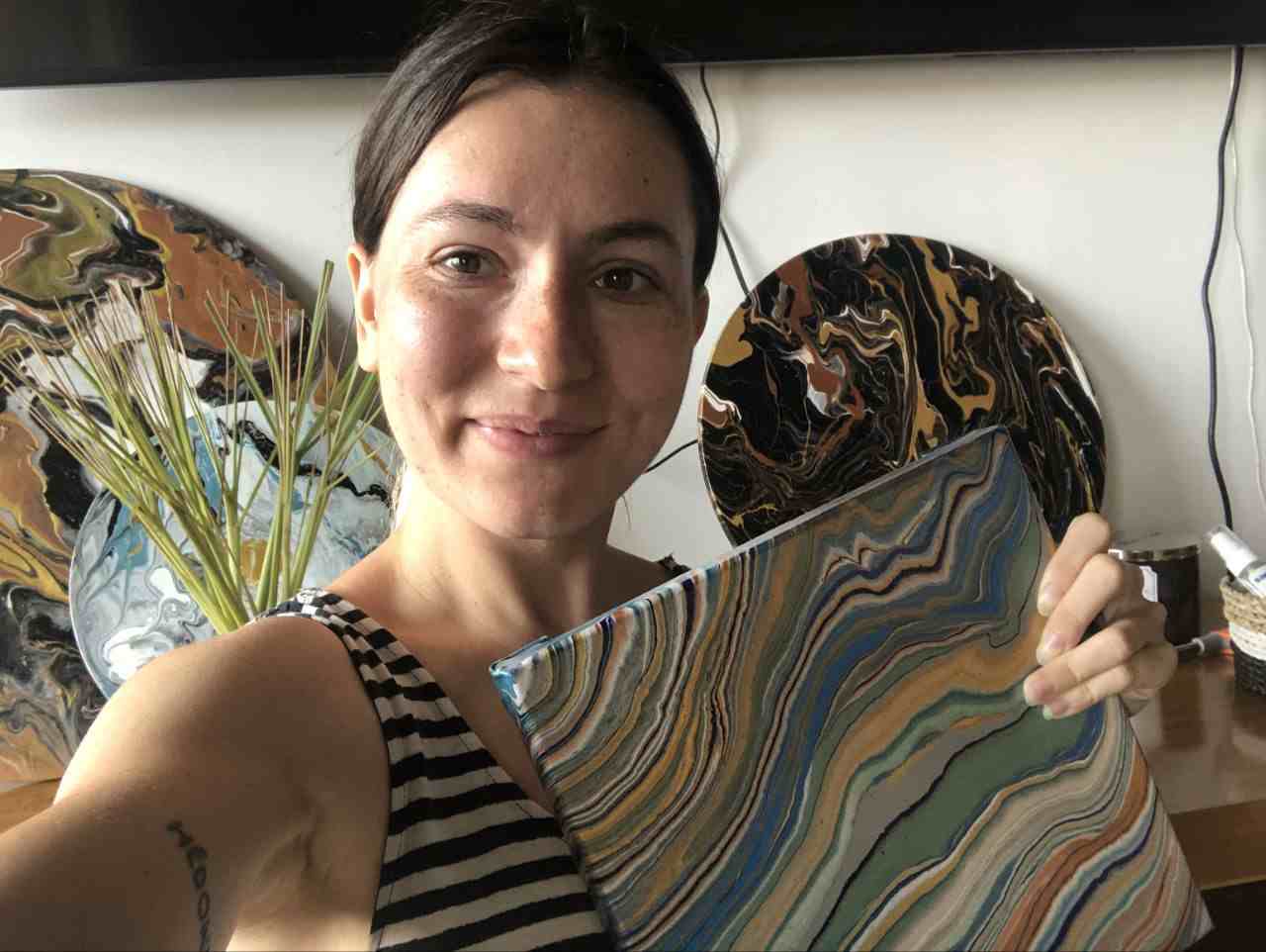
Masha Eretnova, born in 1991, is a Chiang Mai-based certified teacher, artist, and blogger with 20+ years of personal painting journey.
She started painting and drawing very early and is now an international abstract artist and educator passionate about acrylic painting, gouache, and crafts.
Her works are part of international exhibitions and contests, including ArtlyMix (Brazil), Al-Tiba 9 (Spain), Exhibizone (Canada), Italy, and many more.
Besides her artistic pursuits, Masha holds a post-grad diploma in Teaching Film Photography and 2 music school diplomas: piano and opera singing.
