Last Updated on December 17, 2025 by Masha Eretnova
I absolutely love purple color but sometimes it is hard to buy the right shade. Many brands have either purple which is way too dark or a pale violet which is not what I need.
So I often resort to mixing my own paint. Yet, mixing specifically purple is quite challenging as the two colors that are said to make purple – red and blue – do not always create a nice purple shade in reality.
It goes from mud to black in one second.
So let’s find out what specific colors I use to mix my own, perfect, purple.
I will be using acrylic paint for this test.
Basic Color Theory of Purple
There are two important characteristics that we should know about purple color before we mix it.
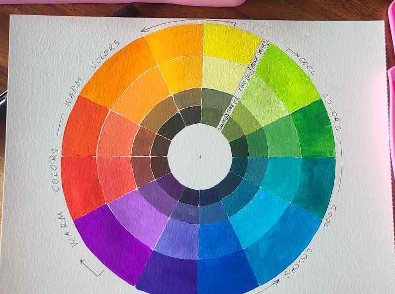
Purple is a secondary color for painters, which means it is a combination of two primary colors red and blue, and different ratios.
For mixing, it is a very important note as it means the purple we get depends on what red and what blue we use. And there are many shades of both: Ultramarine, Cobalt blue, Cyan, and Cerulean for blues, and Crimson, Cadmium Red, Pyrole, Scarlet, and Vermilion for reds, etc.
Each combination will produce a different shade.
At the same time, purple makes a part of another group of colors – cool colors. Those are colors on the right side of my color wheel above- from yellow to purple – they have cooler “temperature”, and are perceived as darker and further away from us in a painting.
This again tells us what colors will work best for mixing purple – cool colors.
Well, here it is a bit of a pickle since we need a red to make purple but red is naturally a warm color.
Easy solution. There are shades of red and close-to-red colors that have cool temperatures like Crimson, Primary Magenta, and some really dark rose colors.
That said, don’t discard warm reds like traditional Cadmium Red completely, I have successfully used it for mixing purple and I’ll share the ratio below.
To sum up: choose neutral blue and red that drift towards cooler colors.
- Do not use reds that look more like orange or have yellow in it (check the label, if you see PY this is not a good red to mix with purple). Perfect choice: cooler reds like Quinacridone Magenta, Magenta, Primary Red, and Crimson.
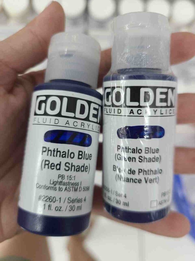
- Do not use blue paint that has a green shade (or green pigment in it, check for PG on the tube). Ex., WInsor and Newton and Golden have two Phthalo blue tubes, one labeled as Green shade, another – Red shade. Use the red shade one.
Mixing different shades of Purple
In making purple color, I use only red and blue; but to make purple and not black, the red color should be more dominant; use roughly 2 parts of red to 1 part of blue.
Purple always seems reddish, warmer.
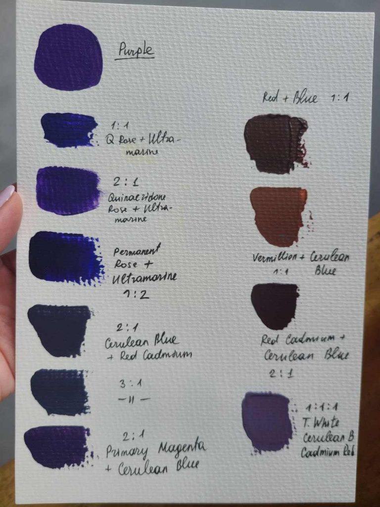
- Experimenting, I found that I should use warm blue and warm red (like Cadmium Red) to mix standard purple.
- In Golden Acrylics I mix Naphthol red with Ultramarine blue and it gives a nice dark purple, perfect for underpainting or a base layer. I used it for painting this pomegranate.
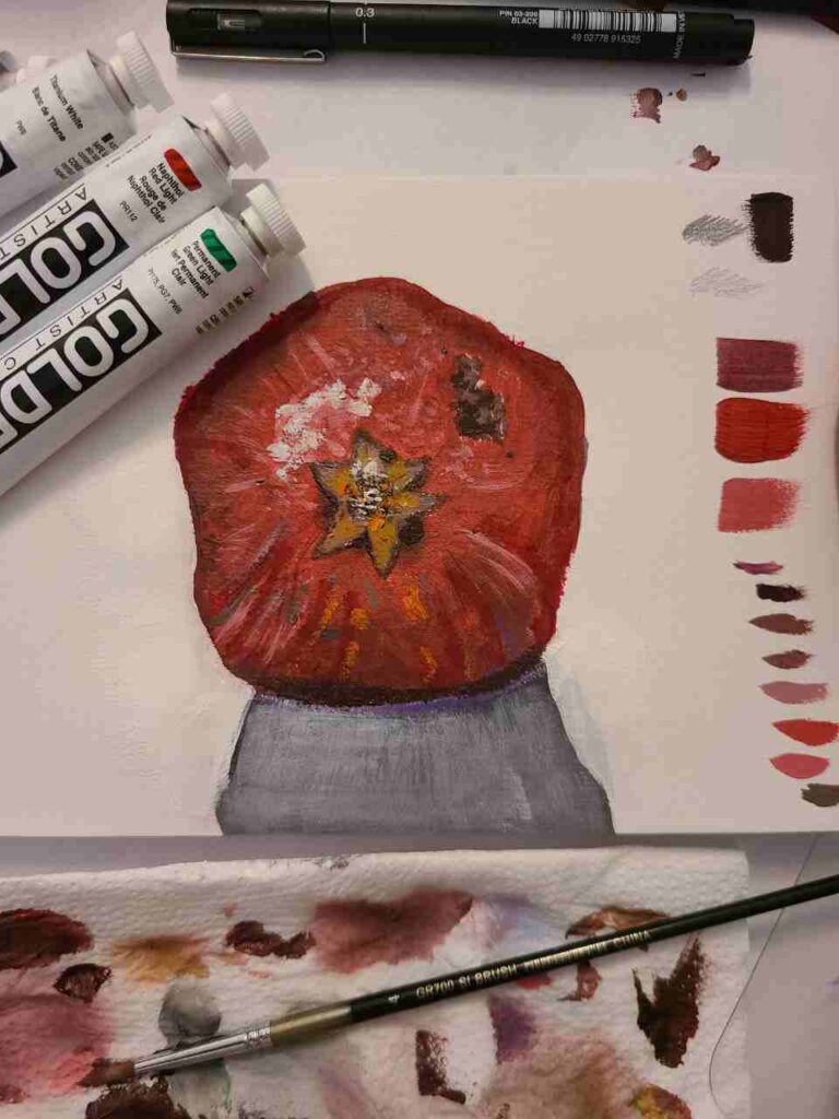
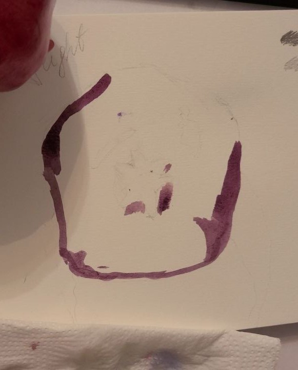
- Mixing magenta (cool red) and warm blue will also work and due to magenta’s brightness, you will get brighter purple or violet (depending on the ratio).
- Cobalt blue mixed with orange makes paler purple, I think a perfect shade for late sunset or night sky.

- Using brighter blue like Turquoise Blue with Magenta will make it brighter and lighter purple.
- Mixing bright Pink (like Quinacridone Rose) and green shades will also make purple, from dark to pale depending on the green you will use. See my color swatch:
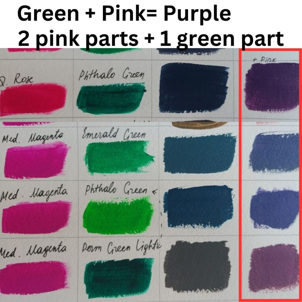
You could also use blue and magenta to produce purple if it feels like mixing red and blue is brown.
- To dull the purple you get down and to lighten it, add a little white paint or yellow (a little bit) to it.
Use artist-grade paints to make sure the pigment is pure and you won’t get mud instead of a new shade.
If I want to mix a bluish shade of Purple, closer to Violet
There is no way we can recreate the actual violet color because in nature it exists as a stand-alone color. Like red, yellow, or blue.
But in painting, we can make a shade of violet, it would be best to use 2/3 blue and 1/3 of red paint. Remember that violet is bluish so if the mix doesn’t look right, add more blue.
Note: Violet seems to be cooler so mixing cool shades of blue and red (magenta) will work the best.
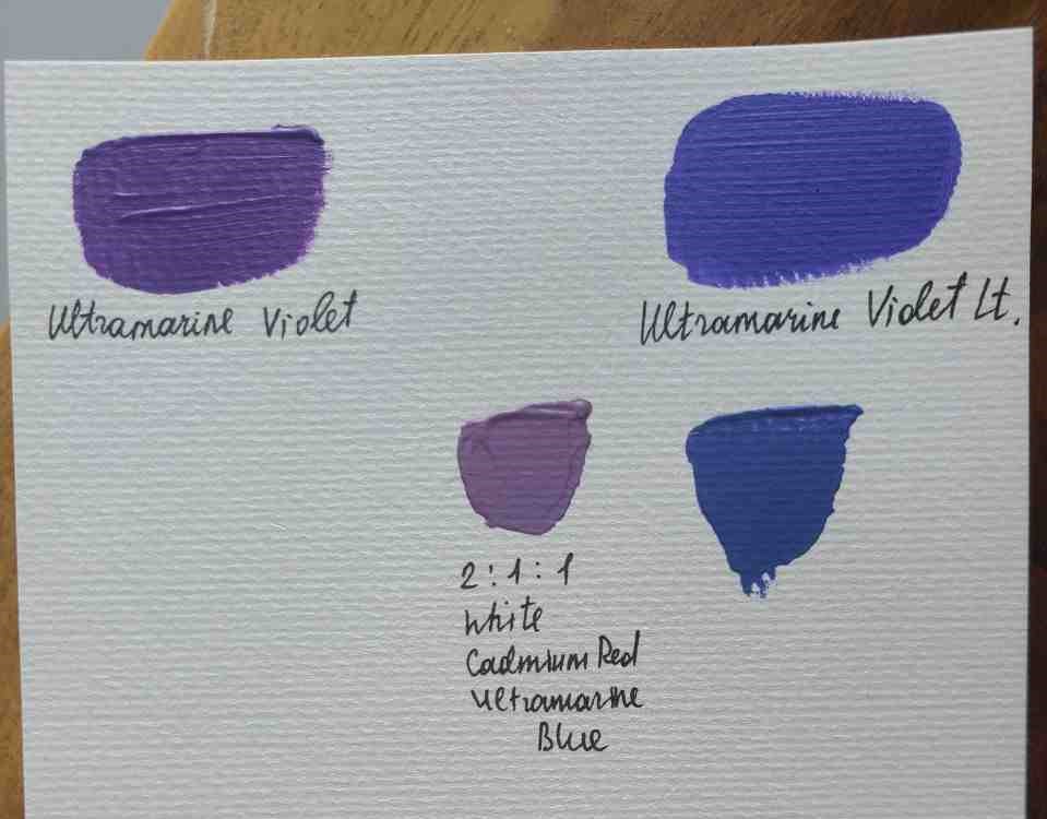
If you will mix Cadmium red with Ultramarine blue and add white you will get a perfect violet shade..
You may also try combining 50% blue, 25% of red, and 25% of black (2:1:1) to make it darker.
Or, try combining 50% blue, 25% of red, and 25% of white to make a lighter shade.
Should I buy or mix purple?
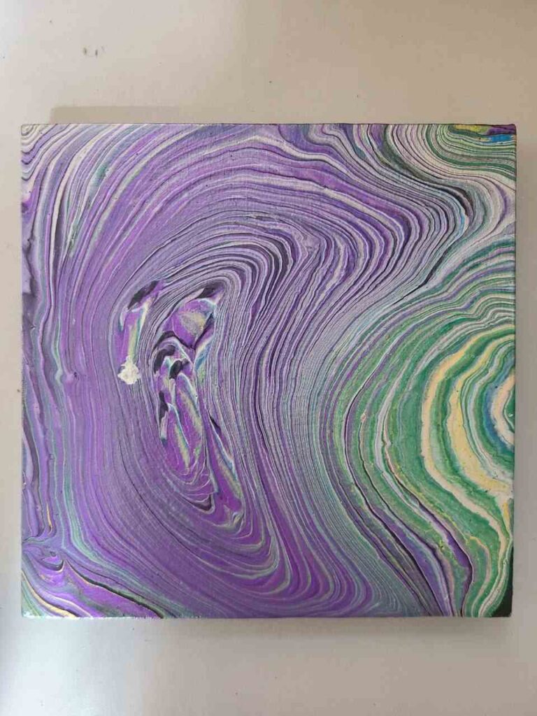
If you struggle with getting a mixing ratio right, simply buy a purple shade.
I find that Liquitex and Amsterdam paint brands have quite a selection of both dark and light shades. I used both and am always satisfied with the quality.
Purple is one of my favorite colors for pouring, it goes well with its complementary color green, in cosmic pours and Dutch pours.
Which ratio worked best for you? If you have any color-mixing questions, ask!

Masha Eretnova, born in 1991, is a Buenos Aires-based certified teacher, artist, and member of the Professional Artist Association with 20+ years of personal painting journey.
She started painting and drawing very early and is now an international abstract artist and educator passionate about acrylic painting, gouache, and crafts.
Her works are part of international exhibitions and contests, including ArtlyMix (Brazil), Al-Tiba 9 (Spain), Exhibizone (Canada), Italy, and many more.
Besides her artistic pursuits, Masha holds a post-grad diploma in Teaching Film Photography and 2 music school diplomas: piano and opera singing.