Last Updated on March 26, 2024 by Masha Eretnova
It is a myth (beneficial for marketing people and brands) that to be successful in painting you need to buy a set of 48 colors.
It is not true, there are basic colors and some variations of the basic acrylic paint palette that you can buy and paint absolutely anything.
I’ve been painting with acrylics since 2018 and here are my 5 must-have acrylic colors to get going and 2 or 4 additional colors I use to extend the palette to make it more convenient.
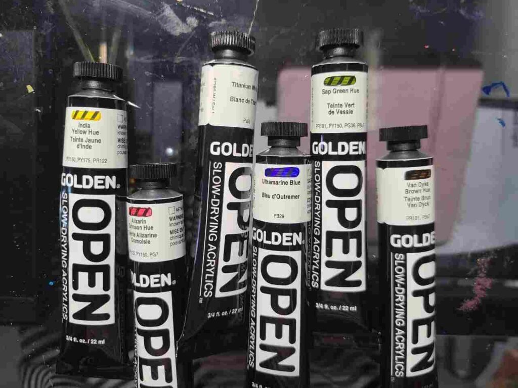
Color Theory for Beginners
With acrylic paint you can create any color you want, including black, using only 3 primary colors: yellow, blue, and red.
As you can guess, they would make the core of your basic palette.
Just by mixing these 3 colors, we can get every color in popular set:
- red and yellow make orange for us
- red and blue will create purple or black
- yellow and blue will make green color, and so on.
Just by learning how to mix colors, you will save yourself hundreds of dollars you would spend on paints and this will allow you to buy fewer colors but of a better quality.
You may not be able to afford 72 colors from Golden, but you can surely afford 3 or 5 if it comes at the same price as a cheaper quality brand.
Learn more: How To Mix Acrylic Paint? – Your Complete Color Mixing Guide
Temperature
Every color can look warmer or cooler.
The temperature of the color is essential for mixing. Intermixing two colors of different temperatures makes a muddy color.
However, having both temperature shades of primary colors helps to expand your mixing options. For ex., warm blue and red will make a darker color closer to black, while cool red and blue will make purple.
Red
- a cool shade of red – Primary red / Crimson / Quinacridone Magenta
- warm red – Cadmium Red
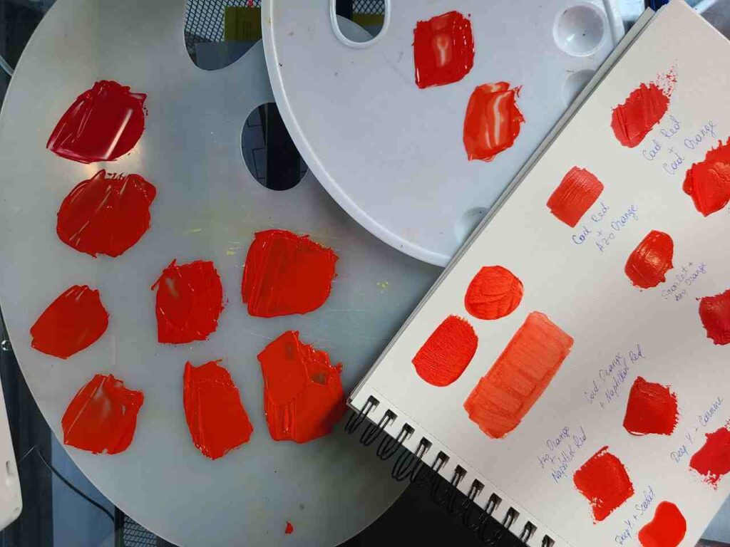
Reds are essential for mixing colors and painting any sunset, floral, or landscape artwork.
Most of the red shades are naturally warm and semi-opaque. The most popular cooler shade of “true” red is Alizarin Crimson. A staple warm red is Cadmium Red.
If you would prefer completely safe to use paints, avoid Cadmium. It is considered cancerogenic, even though, the paint has passed the safety test. Or, choose cadmium-free series, for ex. Liquitex heavy-body paints have that.
Blue
- cool blue shade – Cyan, Primary Blue
- warm blue shade – Ultramarine Blue
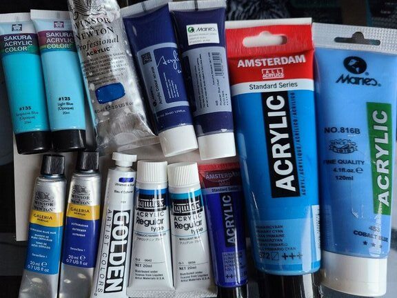
There are blue colors that are really dark and hard to be versatile like Prussian Blue. The most common choice is Ultramarine blue.
For some painters, it is a cool color, for some – warm blue. It will ultimately depend on the brand and if it was a single-pigmented color or a mix. If a mix, you need to check what other colors were mixed.
Buying light blues or turquoise is usually a waste of money as you can easily mix them with blue and white.
Yellow
- Lemon Yellow – cooler shade
- Cadmium Yellow or Deep Yellow – a warm shade of yellow
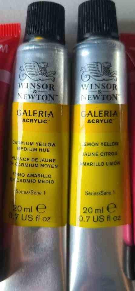
It may seem like the two are similar but they will behave on canvas and in mixing differently and that’s why we need both.
For ex., mixing a touch of Cadmium yellow with red will most likely make orange, but adding cool yellow to red can produce pink.
Black
Mars Black or Ivory Black are the most common black acrylic paints that you can use.
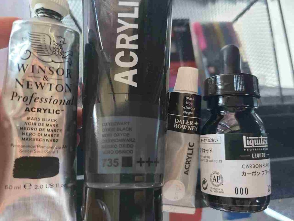
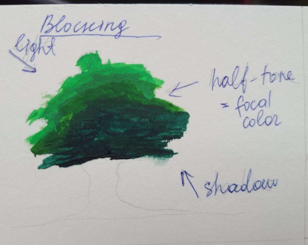
Having black colors makes it easier to create shades – a color + black. You need shades to paint darker spots of any subject to make them look realistic and add volume.
It also translates the light/shadow best.
Technically you can always make your own black but I found that it is not equally easy with different brands.
And I use so much black in my abstract paintings that it doesn’t make sense time-wise for me to mix it every time in such a large amount and waste other colors.
Titanium White
Titanium White (PW6) is the most common white pigment used in white paint and in mixed paints. It is very opaque in most brands.
We always use lots of white, because it is the easiest way to lighten up a color and mix a different value – for ex., to go from red to pink.
White is also useful when we need to increase color’s opacity and make the next layer pop.
With black and white you can mix nice gray colors so there is absolutely no need to buy a tube of gray color when you start acrylic painting.
Brown
Brown is an optional color for those who paint a lot of portraits as it will make mixing skin tones easier.
It is optional because you can always make brown color by mixing any warm complementary colors, for ex., warm orange and blue, red and green, green and purple.
It can be burnt sienna, burnt umber or yellow ochre (light color), van dyke brown, or any other based on the paintings you do.
Note
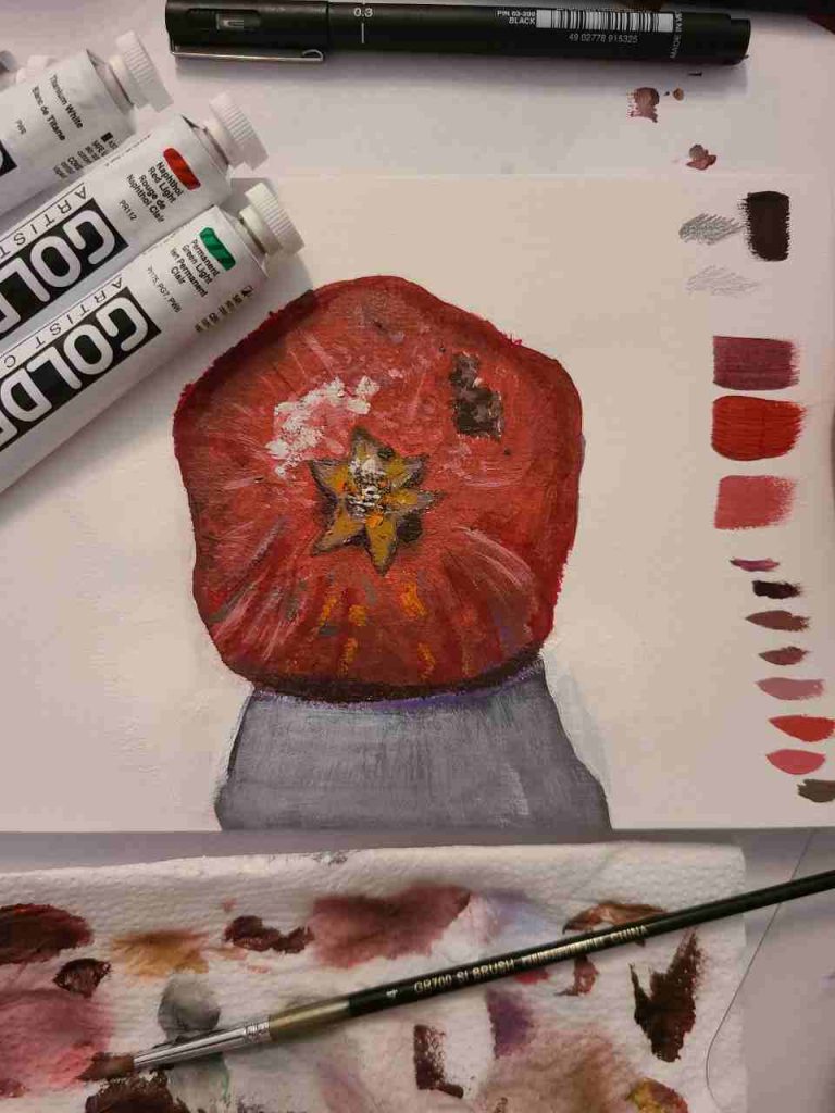
You do not need to buy green, orange, or purple – those are so easy to mix with primary colors! The same goes for pink or sky blue – just add white to a primary color and here you go!
The only time I buy new colors is when I need to test the differences or I want a very unique something like a neon color, pearl, or metallic bronze. Otherwise, there is no need (I know, it is very hard to keep yourself together in an art store, trust me!).
Always check the color chart of the specific brand. The brands I use are Golden, Winsor Newton, Liquitex, and Amsterdam. They have pretty consistent naming but even two blue colors between two brands can be different.
Always check the pigment index if you’re not sure to what color your blue or green will lean into.
And finally, as you can see, there is no need to spend money on a big set. If you don’t want to pick each color separately, go for sets that are 5 to 10 colors – they will have exactly what you need.
A good example is the Winsor & Newton Galeria set – 10 colors, all the ones I mentioned + green, yellow ochre, and umber.
Don’t hesitate to ask about color choice in the comments!
Masha Eretnova, born in 1991, is a Chiang Mai-based certified teacher, artist, and blogger with 20+ years of personal painting journey.
She started painting and drawing very early and is now an international abstract artist and educator passionate about acrylic painting, gouache, and crafts.
Her works are part of international exhibitions and contests, including ArtlyMix (Brazil), Al-Tiba 9 (Spain), Exhibizone (Canada), Italy, and many more.
Besides her artistic pursuits, Masha holds a post-grad diploma in Teaching Film Photography and 2 music school diplomas: piano and opera singing.