Last Updated on May 29, 2026 by Masha Eretnova
If you make art, you will run into these four abbreviations and words sooner or later: RGB, CMYK, RYB, and Pantone.
They sound technical and a little intimidating, but they are just color models, which are different ways of describing and making color depending on where that color is going to end up: canvas, prints, or screen.
In my guide I break each one down in plain language so you know exactly which to reach for, whether your work is heading to a screen, a print shop, or just your easel.
Table of Contents
TL;DR
If you want the quick answer before the details, here it is:
- RGB is for screens (digital art, social media, websites).
- CMYK is for printing (posters, cards, books).
- RYB is for mixing paint by hand (the classic art-class color wheel). That’s where we are at as traditional artists
- Pantone is for matching an exact color every time (logos, branding, merch).
And honestly, if you only paint on canvas and never scan or print your work, you do not really need to worry about most of this. RYB is enough for the studio. The rest starts to matter the moment you want to digitize your art or get it printed or licensed to earn more, which is exactly who this is for.
Two Ways Color Is Made
Before the abbreviations, there is one idea that explains everything else: color, as a physical entity, can be made two ways.
Adding light. Screens start black and add colored light to build an image. The more light you add, the brighter it gets, until you reach white. This is called additive color, and it is how RGB works.
Taking light away. Paint and ink start with a white surface and subtract light by absorbing it. The more you layer on, the darker it gets, until you reach black. This is called subtractive color, and it is how RYB, CMYK, and Pantone work.
This is why a glowing neon on your tablet often looks dull once it is printed. The screen was adding light, and the paper can only take it away. Does it make sense?
RYB: The Color Wheel We Learned in School
RYB stands for red, yellow, and blue.
It is the classic artist’s color wheel, the one taught in grade school art class. Mix red and yellow for orange, blue and yellow for green, red and blue for purple.
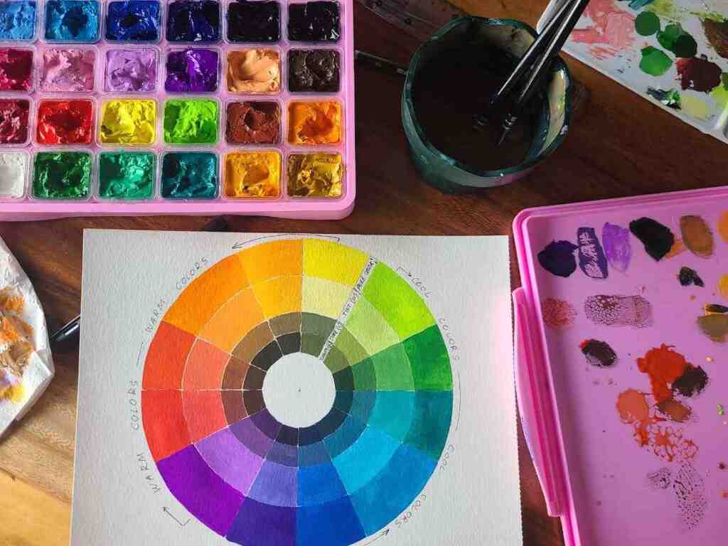
It feels natural because it matches how most people instinctively think about color. For mixing real paint on a palette, it is a friendly starting point.
However…
News flash… RYB is not scientifically accurate.
It is a centuries-old approximation, and the “true” subtractive primaries are actually cyan, magenta, and yellow.
This is the real reason mixed colors came out murky and your pinks looked muddy. Any Red and blue paint simply cannot produce a bright cyan or a clean magenta. If you have ever felt like you were doing something wrong when a color turned to mud, you were not. (see some mixing tips here)
For traditional painting, RYB still works beautifully, especially once you add white and black to expand your range.
RGB: For Anything on a Screen
RGB stands for red, green, and blue, the three colors of light your screen uses.
At full strength all three together make white. With all three switched off you get black.
This is the world of digital art. Procreate, Photoshop, Krita, and almost every drawing app work in RGB by default.
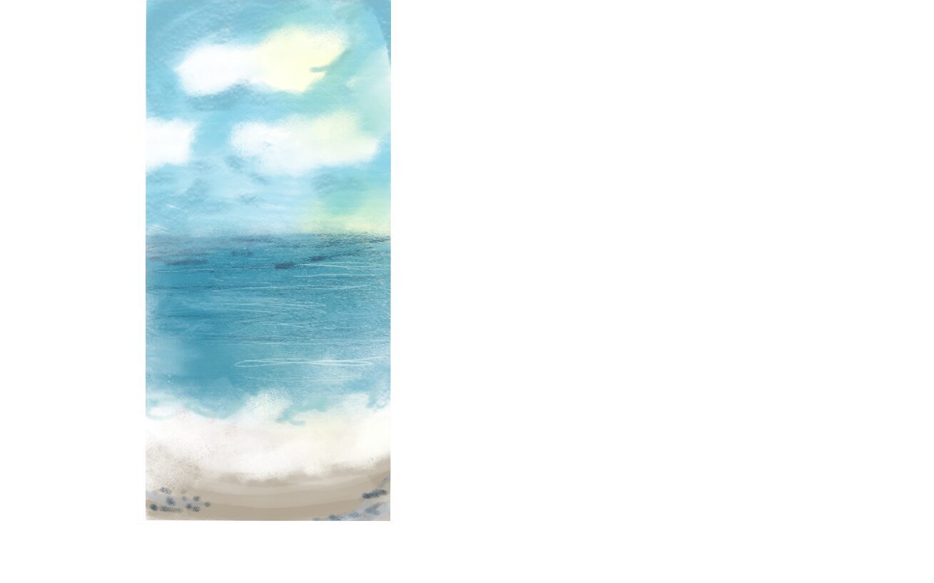
Reach for RGB when your art is meant to be seen on a screen:
- Social media posts and online portfolios
- Digital illustration and concept art
- Anything for websites, video, or games
The upside vs RYB is range. Screens can produce glowing, electric colors that no paint or ink can match. The catch is that those same colors only exist as light. The moment you try to print them, they shift, because ink cannot recreate a backlit glow.
One practical note: monitors are not all calibrated the same way, so a color can look slightly different from one device to the next.
This matters most if you sell prints or need exact color, or if you are trying to convert your painted art into prints. You will have to get a photoshop or something to adjust colors for screen. It isn’t cheating, it is mandatory so your printed result looks as good as your real work.
CMYK: For Anything Printed
CMYK stands for cyan, magenta, yellow, and key, where key means black.
These are the four inks a standard printer lays down on paper. More ink means a darker color, and bare paper gives you white.
If your work is going to be physically printed, this is your system.
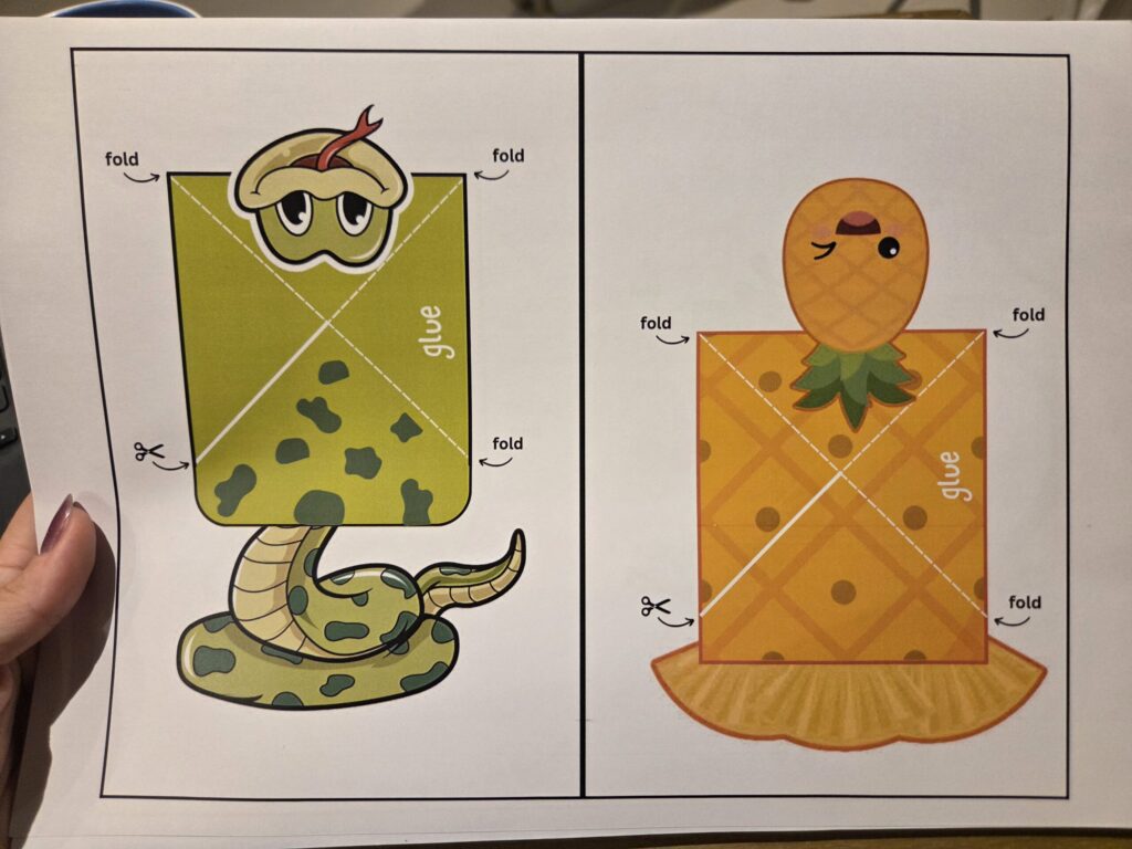
Reach for CMYK when you are making:
- Posters, prints, and art books
- Stickers, cards, and packaging
- Canvas reproductions of your paintings
Because CMYK matches what printers can actually produce, it cuts down on nasty surprises. The trade-off is a smaller range than RGB. Bright, punchy screen colors get noticeably tamer in print, and very light tones can look slightly grainy up close because they are built from tiny dots of ink.
The smart habit is to design in RGB if you like the wider palette while sketching, then convert to CMYK before printing and adjust by eye.
Better yet, order a small proof print before committing to a big run. A few dollars on a sample beats a hundred posters in the wrong color.
Getting your art ready to print
If you are printing through Canva or sending a Canva file to a print shop, do this before you download:
- Set your file type to PDF Print, which exports at 300 DPI (sharp enough for paper).
- Tick Crop marks and bleed so the printer knows where to trim and your color runs all the way to the edge with no white border.
- If you have Canva Pro, change the color profile to CMYK. On the free plan you can only export in RGB, so the print shop will convert it for you, and you may see a little color shift.
If you are using a separate print shop, send them a PDF, not a JPG or PNG, and ask two questions up front: what color profile do they want, and do they offer a proof. Most good shops will flag problems before they print. Keep your important text and logos away from the very edge so nothing gets cut off in trimming.
Do not ever order a whole batch without a color testing first.
Pantone: For Exact, Repeatable Color
Pantone works differently from the others, because it is not really a way of mixing color at all. It is a library of pre-mixed inks, each with its own code, like PMS 186 C for a particular red.
Instead of building a color out of other colors, you pick a finished ink off the shelf. That ink comes out the same every single time, which is the entire point of it.
Use Pantone for:
- Logos and branding, where a color must stay identical everywhere
- Limited-edition prints and merch
- Special finishes like metallics and fluorescents that CMYK simply cannot reproduce
Pantone was created in 1963 by Lawrence Herbert, a chemist who had bought a small New Jersey printing company.
At the time, printers mixed inks by guesswork, so one shop’s “red” rarely matched another’s. Herbert standardized the chaos by giving every color a fixed formula and a number, so anyone, anywhere, could order the exact same shade.
The catch is cost. Each Pantone color needs its own ink and printing plate, which gets expensive fast. It is overkill for a full, colorful painting, but ideal for a logo or a single accent color that has to be perfect.
Quick Comparison
| RYB | RGB | CMYK | Pantone | |
|---|---|---|---|---|
| How color is made | Mixing pigment | Adding light | Layering ink | Pre-mixed ink |
| Best for | Painting by hand | Screens | Printing | Exact color matching |
| Color range | Narrowest | Widest | Medium | Specialty colors |
| Where it lives | Canvas and paper | Phones, monitors | Posters, books | Branding, merch |
How to Move Color Between Systems
Converting between these is where beginners run into trouble, so here is what to expect.
From hand-painted to digital. There is no direct conversion. You photograph or scan your painting, which captures it in RGB, and edit from there. Colors will shift, so compare against the real piece as you go.
From RGB to CMYK. This is the big one for digital artists who want prints. Your software can convert automatically, but bright colors will lose some life. Work in RGB, convert late, and tweak the dulled colors by hand before printing.
From RGB or CMYK to Pantone. Software can suggest the closest Pantone match, but it is only an approximation. The screen and the ink will never line up perfectly, which is exactly why designers keep a physical Pantone swatch book on the desk.
The one rule to remember: always proof before you commit. Screen-to-print shifts are real and predictable, and a cheap test print saves you from a costly mistake.
Which One Do You Actually Need?
You do not need to master all four. You need the right one for where your art is going.
- Mixing paint on a canvas? RYB to start, and consider cyan-magenta-yellow paints if you want brighter mixes.
- Posting digital art online? RGB.
- Selling prints or making a book? CMYK.
- Designing a logo or branded merch? Pantone.
If a piece needs to do both, say an illustration that lives online and also gets printed, plan for both from the start rather than converting at the last minute.
Beginner Mistakes to Avoid
A few simple habits will save you a lot of frustration.
Set your color mode early. Choose RGB or CMYK when you start a digital project, not halfway through. Switching modes late can scramble your colors.
Do not trust the screen for print. What glows on your monitor will look softer on paper. Always assume some shift and proof it.
Match the system to the goal, not the other way around. Decide where the art is going first, then pick the color system. It is much harder to fix this backward.
Final Thoughts
These four systems are just tools, and each one is good at a different job. RYB is for mixing paint in the studio. RGB is for vivid color on screens. CMYK is for getting it onto paper. Pantone is for a shade you can repeat exactly, every time.
You do not have to choose a favorite. Plenty of artists paint in RYB, scan into RGB, print in CMYK, and brand with Pantone, all in the same career. Learn what each one is for, and color stops being a guessing game.
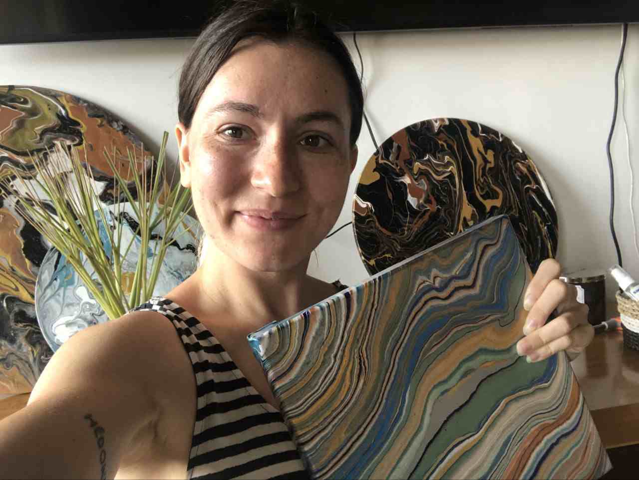
Masha Eretnova, born in 1991, is a Chiang Mai-based certified teacher, artist, and blogger with 20+ years of personal painting journey.
She started painting and drawing very early and is now an international abstract artist and educator passionate about acrylic painting, gouache, and crafts.
Her works are part of international exhibitions and contests, including ArtlyMix (Brazil), Al-Tiba 9 (Spain), Exhibizone (Canada), Italy, and many more.
Besides her artistic pursuits, Masha holds a post-grad diploma in Teaching Film Photography and 2 music school diplomas: piano and opera singing.