Last Updated on October 4, 2025 by Masha Eretnova
For anyone dipping their brush into acrylic painting, the world of pigments and colors can feel like a maze of cryptic codes PW6? PR108? I hope we ditched equations and stuff like that at school! Overwhelming choices and price shock at the art supply store.
Maybe you’ve grabbed a cheap tube of “Cadmium Red” only to find it turns muddy when mixed, or wondered why your “Ultramarine Blue” looks dull compared to a pro’s work. Or “Is this $15 tube really worth it?”
I want to help you understand if you’re wasting your time (or money) with certain tubes. I’ll break down what those Color Index codes (like PY42 or PB15) mean, how pigments are made and sourced, and why some colors cost a fortune while others don’t.
Table of Contents
Pigment Index Chart (Used in Modern Acrylic Paints)
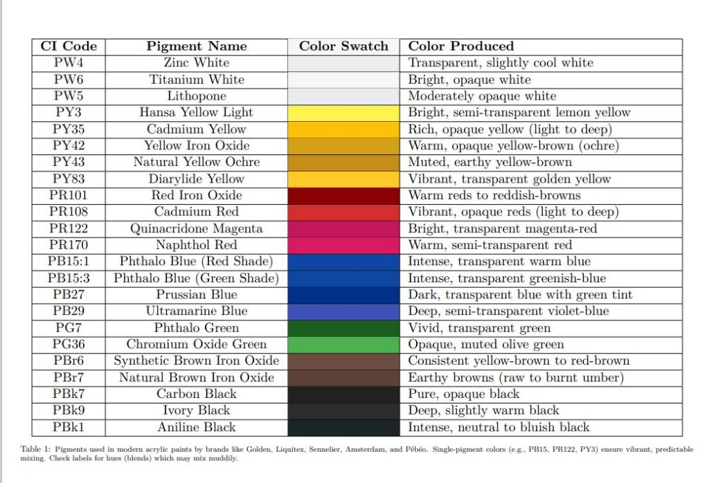
I have the same info in a table, too, for your convenience:
| CI Code | Pigment Name | Color Produced |
|---|---|---|
| PW4 | Zinc White | Transparent, slightly cool white |
| PW6 | Titanium White | Bright, opaque white |
| PW5 | Lithopone | Moderately opaque white |
| PY3 | Hansa Yellow Light | Bright, semi-transparent lemon yellow |
| PY35 | Cadmium Yellow | Rich, opaque yellow (light to deep) |
| PY42 | Yellow Iron Oxide (Synthetic) | Warm, opaque yellow-brown (ochre) |
| PY43 | Natural Yellow Ochre | Muted, earthy yellow-brown |
| PY83 | Diarylide Yellow | Vibrant, transparent golden yellow |
| PR101 | Red Iron Oxide (Synthetic) | Warm reds to reddish-browns (e.g., burnt sienna) |
| PR108 | Cadmium Red | Vibrant, opaque reds (light to deep) |
| PR122 | Quinacridone Magenta | Bright, transparent magenta-red |
| PR170 | Naphthol Red | Warm, semi-transparent red |
| PB15 | Phthalo Blue | Intense, transparent blue (green or red shade) |
| PB27 | Prussian Blue | Dark, transparent blue with greenish tint |
| PB29 | Ultramarine Blue | Deep, semi-transparent violet-blue |
| PG7 | Phthalo Green | Vivid, transparent green (blue or yellow shade) |
| PG36 | Chromium Oxide Green | Opaque, muted olive green |
| PBr6 | Synthetic Brown Iron Oxide | Consistent yellow-brown to red-brown |
| PBr7 | Natural Brown Iron Oxide | Earthy browns (raw to burnt umber) |
| PBk7 | Carbon Black | Pure, opaque black |
| PBk9 | Ivory Black (Bone Black) | Deep, slightly warm black |
Pigment Codes And Colors They Make (and You Buy)
There are 7 main pigments most manufacturers work with: white, yellow, red, blue, green, brown, and black. All other colors are usually simple blends of different pigments (sometimes up to 3 pigments in one tube!).
Letters: P stands for Pigments and then follows the letter standing for color, for ex., W for white, so we have PW – white pigments. Then, a number PW6 that will mean a specific color within the range of what this pigment can make. So each pigment can have several different numbersreferring to different “shades” so to say.
Sometimes you will see the letters and numbers at the front of the tube, and sometimes at the back.
White Pigments
PW6 – Titanium White
- Single or Blend: Single-pigment color.
- Common Examples: “Titanium White” (Golden, Liquitex, Sennelier).
- Pure PW6 is standard; blends with PW4 occur in some “Mixing White” variations. It is one of the most opaque colors in your palette and can help you mixing new colors (tints), or even making paint more opaque.
PW4 – Zinc White
- Single or Blend: Single-pigment color, occasionally blended with PW6.
- Common Examples: “Zinc White” (Golden), “Mixing White” (Liquitex, PW4 + PW6).
- Blends enhance opacity while retaining transparency.
PW1 – Lead White (Flake White)
- Single or Blend: Single-pigment historically; modern “hues” are blends because the original pigment is highly toxic. Modern blends are safe.
- Common Examples: “Flake White Hue” (Winsor & Newton, PW6 + PY42).
PW5 – Lithopone
- Single or Blend: Single-pigment color.
- Common Examples: Rare in artist-grade acrylics; found in industrial lines.
- Notes: Not typically blended in fine art paints.
Yellow Pigments
PY3 – Hansa Yellow Light
- Single or Blend: Single-pigment color.
- Common Examples: “Hansa Yellow Light” (Golden), “Azo Yellow Light” (Liquitex).
- Notes: Pure for bright, clean yellows.
PY35 – Cadmium Yellow
- Single or Blend: Single-pigment color; hues are blends.
- Common Examples: “Cadmium Yellow Medium” (Sennelier), “Cadmium Yellow Hue” (Golden, PY3 + PY83).
- Notes: Hues mimic cadmium’s vibrancy with safer pigments.

PY42 – Yellow Iron Oxide (Synthetic)
- Single or Blend: Single-pigment or blended in earth tones.
- Common Examples: “Yellow Oxide” (Golden), “Yellow Ochre” (Amsterdam, PY42 + PBr7).
- Notes: Blends add depth to ochre tones.
PY43 – Natural Yellow Ochre
- Single or Blend: Single-pigment traditionally.
- Common Examples: “Yellow Ochre” (Pébéo), “Raw Sienna” (Liquitex, PY43 + PBr7).
- Notes: Natural impurities may act like a blend.
Red Pigments

PR101 – Red Iron Oxide (Synthetic)
- Single or Blend: Single-pigment or blended.
- Common Examples: “Red Oxide” (Golden), “Burnt Sienna” (Sennelier, PR101 + PBr7).
- Notes: Blends create richer earth reds.
PR108 – Cadmium Red
- Single or Blend: Single-pigment; hues are blends.
- Common Examples: “Cadmium Red Medium” (Liquitex), “Cadmium Red Hue” (Amsterdam, PR170 + PY83).
PR122 – Quinacridone Magenta
- Single-pigment color.
- Common Examples: “Quinacridone Magenta” (Golden), “Permanent Magenta” (Liquitex).
- Notes: Rarely blended due to its pure mixing strength.
PR170 – Naphthol Red
- Single or Blend: Single-pigment color.
- Common Examples: “Naphthol Red” (Golden), “Naphthol Crimson” (Pébéo).
- Notes: Used alone for warm reds.
Blue Pigments
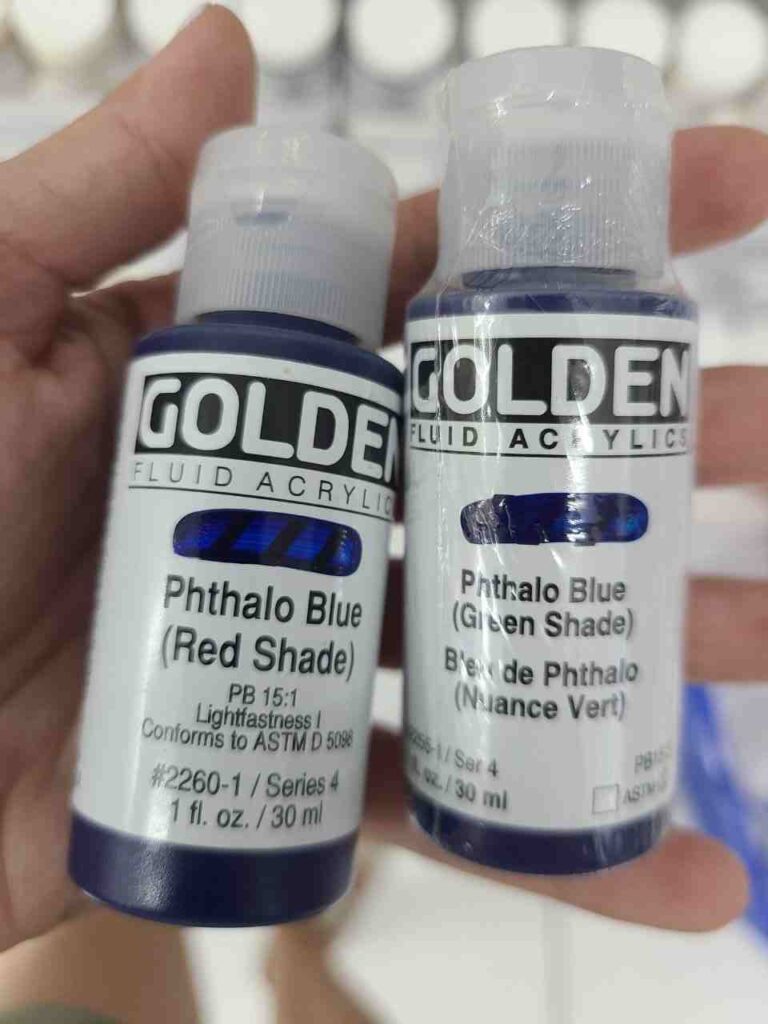
PB15 – Phthalo Blue
- Single or Blend: Single-pigment color but it has sub codes to indicate the undertone, most common ones are red and green undertone, (e.g., PB15:3 for green shade, PB15:1 or PB15:2 for red undertone.
- Common Examples: “Phthalo Blue Green Shade” (Golden), “Phthalocyanine Blue” (Amsterdam).
PB29 – Ultramarine Blue
- Single-pigment color.
- Common Examples: “Ultramarine Blue” (Liquitex, Sennelier).
- Notes: Pure for its rich, violet-toned blue.
PB27 – Prussian Blue
- Single-pigment color.
- Common Examples: “Prussian Blue” (Golden), “Antwerp Blue” (Liquitex, PB27 + PB15).
- Notes: Blends are rare but enhance greenish tones.
Green Pigments
PG7 – Phthalo Green
- Single or Blend: Single-pigment color.
- Common Examples: “Phthalo Green Blue Shade” (Golden), “Phthalocyanine Green” (Pébéo).
- Notes: Strong enough to stand alone.
PG36 – Chromium Oxide Green
- Single or Blend: Single-pigment color.
- Common Examples: “Chromium Oxide Green” (Golden), “Opaque Green” (Amsterdam).
- Notes: Rarely blended due to its muted stability.
Brown Pigments
PBr7 – Natural Brown Iron Oxide
- Single or Blend: Single-pigment or blended.
- Common Examples: “Raw Umber” (Liquitex), “Burnt Umber” (Sennelier, PBr7 + PR101).
- Notes: Blends deepen the tone.
PBr6 – Synthetic Brown Iron Oxide
- Single-pigment or blended.
- Common Examples: “Mars Brown” (Golden), “Transparent Brown Oxide” (Liquitex).
Black Pigments
PBk9 – Ivory Black (Bone Black)
- Single-pigment color.
- Common Examples: “Ivory Black” (Sennelier, Golden).
- Notes: Rarely blended for its warm tone.
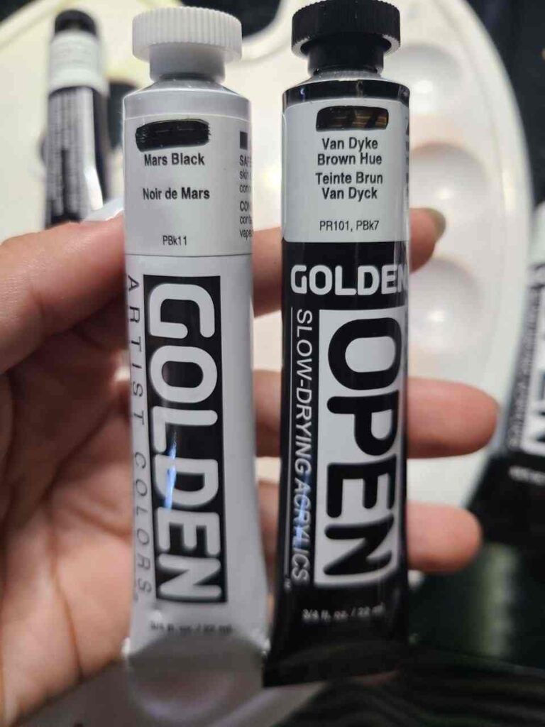
PBk7 – Carbon Black
- Single-pigment color.
- Common Examples: “Carbon Black” (Golden), “Mars Black” (Liquitex, PBk7 + PBr6).
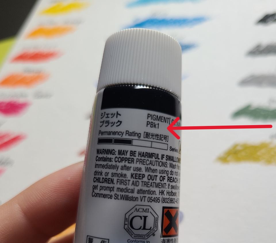
PBk1 – Aniline Black (Azine Black)
- This pigment is less common black since it is much more expensive. I have the only black paint with it bought in Japan. You won’t find it in student-grade paints.
- Dry pigment is rather toxic but ready-to-use paint is safe.
Common Pigment Blends
Blended colors in acrylic paints combine multiple pigments to achieve specific hues, often for convenience, cost, or to replicate traditional or toxic shades safely.
Below are examples from Sennelier, Liquitex, Golden, Amsterdam, and Pébéo, based on typical color charts and pigment disclosures from these brands.
Brands like Golden and Liquitex emphasize single-pigment colors (e.g., PB15, PR122) in their professional lines for mixing purity, while blends dominate convenience hues (e.g., “Sap Green”).
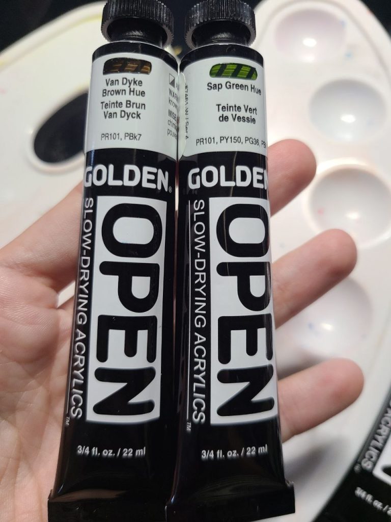
Sometimes a color doesn’t have the same name pigment, look at this brown color on the right – it is blended with black and red, not with single brown pigment! It is crucial to know as it will affect how it will act when we mix it
Naples Yellow Hue
- Brand: Golden
- Pigments: PW6 (Titanium White) + PY42 (Yellow Iron Oxide) + PR101 (Red Iron Oxide)
- Resulting Color: A warm, opaque, creamy yellow with a slight reddish undertone, mimicking historical Naples Yellow (once lead-based)..
Sap Green
- Brand: Liquitex
- Pigments: PG7 (Phthalo Green) + PY42 (Yellow Iron Oxide) + PBk7 (Carbon Black)
- Resulting Color: A deep, transparent forest green with a natural, earthy tone.
- Notes: A convenience blend for landscape painters; variations may include PBr7.
Hooker’s Green
- Brand: Sennelier (Abstract line)
- Pigments: PG7 (Phthalo Green) + PY83 (Diarylide Yellow) + PBk9 (Ivory Black)
- Resulting Color: A rich, dark green with a slightly yellowish tint, ideal for foliage.
- Notes: Sennelier’s version emphasizes vibrancy; other brands might use PY42 or PB15.
Burnt Sienna
- Brand: Amsterdam (Standard Series) and majority of brands
- Pigments: PR101 (Red Iron Oxide) + PBr7 (Natural Brown Iron Oxide)
- Resulting Color: A warm, reddish-brown with strong opacity, classic for earth tones.
Venetian Red
- Brand: Pébéo (Studio Acrylics)
- Pigments: PR101 (Red Iron Oxide) + PY42 (Yellow Iron Oxide)
- Resulting Color: A muted, brick-red with a warm, earthy feel.
Cadmium Orange Hue
- Brand: Liquitex
- Pigments: PY83 (Diarylide Yellow) + PR170 (Naphthol Red)
- Resulting Color: A bright, semi-opaque orange mimicking cadmium’s vibrancy.
- Notes: A cadmium-free blend is also available!
Viridian Hue
- Brand: Golden
- Pigments: PG7 (Phthalo Green) + PB15:3 (Phthalo Blue Green Shade)
- Resulting Color: A bright, transparent teal-green, replicating toxic viridian (PG18).
- Notes: Golden’s high-pigment load ensures intensity in this blend.
Raw Umber
- Brand: Sennelier
- Pigments: PBr7 (Natural Brown Iron Oxide) + PBk7 (Carbon Black)
- Resulting Color: A cool, dark brown with a greenish undertone.
- Notes: Sennelier’s blend adds depth for naturalistic shading.
Mars Black
- Brand: Amsterdam
- Pigments: PBk7 (Carbon Black) + PBr6 (Synthetic Brown Iron Oxide)
- Resulting Color: A neutral, opaque black with a slight brownish tint.
- Notes: A practical blend for a less stark black than pure PBk7.
Permanent Rose
- Brand: Pébéo
- Pigments: PR122 (Quinacridone Magenta) + PW6 (Titanium White)
- Resulting Color: A soft, opaque pinkish-red with excellent permanence.
- Notes: Pébéo blends for a lighter, more accessible rose shade.
How Pigments Are Made?
Pigments for acrylic paints are either mined from the earth (natural) or manufactured in labs (synthetic).
Brands like Golden, Liquitex, Sennelier, Amsterdam, and Pébéo source pigments from specialized suppliers worldwide.
- Natural pigments, like Yellow Ochre (PY43) or Raw Umber (PBr7), are mined, purified, and ground into fine powders.
- Synthetic pigments, such as Phthalo Blue (PB15) or Quinacridone Magenta (PR122), are chemically engineered for consistency and vibrancy.
Suppliers process these raw materials—whether from mineral deposits (e.g., iron oxides in Spain or Italy) or industrial synthesis (e.g., phthalocyanines from chemical plants)—and sell them to paint manufacturers, who mix them with acrylic binders (polymer emulsions) and additives to create paint.
>> More on paint composition.
Organic vs. Synthetic Pigments
Organic Pigments are derived from carbon-based compounds, either natural (rarely used today) or synthetic.
Examples: PY3 (Hansa Yellow), PR122 (Quinacridone Magenta), and PG7 (Phthalo Green).
They’re known for bright, transparent colors and strong tinting strength but may have lower lightfastness unless engineered (e.g., quinacridones are highly permanent).
Synthetic Inorganic Pigments are made from minerals or metals, often lab-created for stability. Examples include PW6 (Titanium White), PR101 (Red Iron Oxide), and PB29 (Ultramarine Blue). They’re typically opaque, durable, and lightfast but less vivid than organics.
Which is Better? you may ask. Well, depends on your needs.
Organic pigments excel in vividness and mixing (great for bold, modern art), while synthetic inorganics offer opacity and permanence (ideal for layering or realism). Beginners might prefer organics for bright colors; intermediates might value inorganics for longevity.
Pigments Differ in Artist-Grade vs. Student-Grade Paints
Artist-Grade (e.g., Golden Heavy Body, Sennelier Abstract) have higher pigment load, often single-pigment colors (e.g., PB15, PR122), and premium binders. Expensive pigments like cadmiums (PY35, PR108) or quinacridones drive up costs ($10–$20/tube). Colors are vibrant, mix predictably, and last decades without fading (high lightfastness, rated I or II on ASTM scale).
Student-Grade (e.g., Amsterdam Standard, Pébéo Studio): Lower pigment concentration, more fillers (e.g., chalk), and frequent blends (e.g., “Cadmium Red Hue” with PR170 + PY83). Cheaper ($3–$7/tube) due to synthetic substitutes and less pigment, but colors may be less intense, muddy when mixed, or fade over time (lightfastness III or lower).
A tube of Golden’s “Cadmium Red” (PR108) costs more than Amsterdam’s “Cadmium Red Hue” because cadmium is mined and toxic (higher production costs), while hues use affordable synthetics. Rare or complex pigments (e.g., PR122) also bump up artist-grade prices.
For ex., I own a little set of rare Matisse acrylics I bought in Japan where each color is made with incredibly unique high-quality pigments. The tiniest tubes were about 35 USD.
Buying Paint Tips for Beginners
For vibrant mixes, pick single-pigment artist-grade paints (check labels for one pigment code, e.g., “PG7”). Blends (e.g., “Sap Green”) are convenient but limit control.
Cheap paint don’t have pigment labels. It means it is likely a blend and there is probably very little “real” pigment, but more fillers that are super cheap in manufacturing. The colors can still be bright, though, but may not correspond 100% to what’s on the box/label.
Start with student-grade for practice (e.g., Amsterdam), then invest in artist-grade primaries (red, blue, yellow) for serious work. A $15 tube of Golden “Phthalo Blue” goes further than a $5 blend-heavy alternative.
Paint is pigment + binder + additives. Artist-grade has more pigment (better color), less filler; student-grade leans on fillers (thicker but weaker). Check pigment info on tubes—more codes often mean blends, not purity.
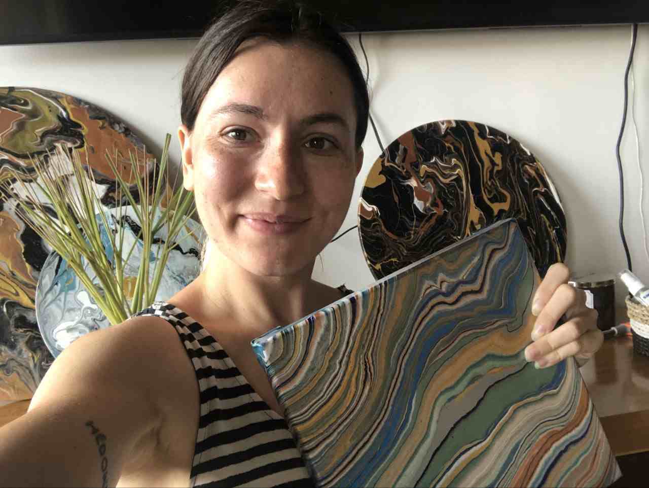
Masha Eretnova, born in 1991, is a Chiang Mai-based certified teacher, artist, and blogger with 20+ years of personal painting journey.
She started painting and drawing very early and is now an international abstract artist and educator passionate about acrylic painting, gouache, and crafts.
Her works are part of international exhibitions and contests, including ArtlyMix (Brazil), Al-Tiba 9 (Spain), Exhibizone (Canada), Italy, and many more.
Besides her artistic pursuits, Masha holds a post-grad diploma in Teaching Film Photography and 2 music school diplomas: piano and opera singing.