Last Updated on March 20, 2024 by Masha Eretnova
Looking for the best pouring color combinations that catch the eye, are easy to pour, and don’t cost an arm and a leg? I’m here for you!
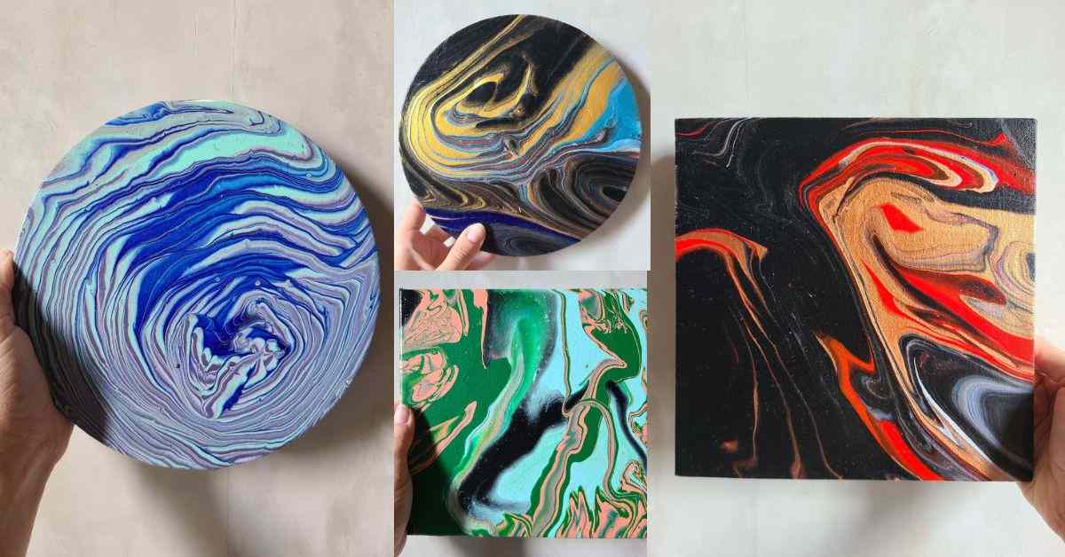
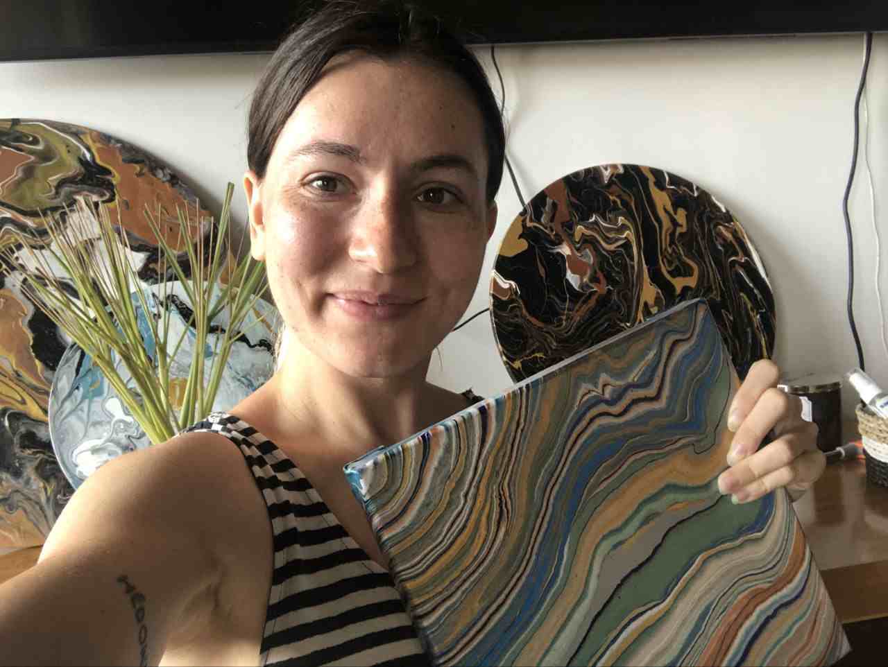
I love acrylic pouring so much I’ve done dozens of techniques and even if I mostly do dirty pours with some swirl or ring pour elements and so far, the results and colors are absolutely beautiful.
I’ll share the exact colors and pours I made as well as some suggested and most popular pour paint color combinations others use for fluid art.
Let’s pour!
This article contains affiliate links. It means no extra cost for you but a little commission (2-3%) for me to support my hobby and blog. Thank you!
Popular Color Schemes for Acrylic Pouring
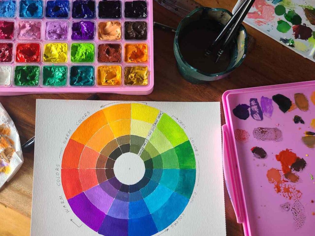
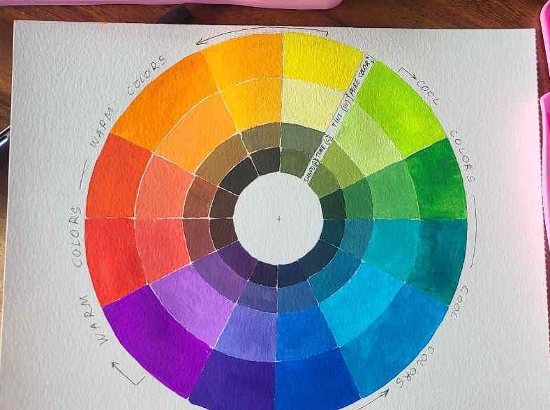
While art is the playground and safe space to experiment, there are some color-matching rules based on color theory.
Many colors go well together, and the best color combinations will depend on the context and the desired effect.
Here are some general color combinations rules that tend to work:
- Complimentary colors: Complementary colors are on opposite sides from each other on the color wheel, such as red and green, blue and orange, or yellow and purple. These colors create a strong contrast and can be used to create a dynamic and visually interesting color scheme.
- A split complementary color scheme uses 2 secondary colors and 1 primary color. For ex., yellow, green, and orange.
- Analogous color scheme: Analogous colors are next to each other on the color wheel, such as blue, blue-green, and green. These colors create a harmonious and cohesive color scheme that can be used to create a calming and relaxing environment.
- Monochromatic colors: Monochromatic colors are different shades and tints of the same color, such as light blue, medium blue, and dark blue. This color scheme creates a subtle and sophisticated look that can be used in a variety of contexts.
- Triadic color scheme: Triadic colors are 3 colors that are evenly spaced on the color wheel, such as red, yellow, and blue, or orange, purple, and green. This color scheme creates a bold and vibrant look that can be used to create a sense of energy and excitement.
- Tetradic schemes are 2 pairs of complementary colors. For ex., green, blue, orange, red.
- A square color scheme is when we use four colors that are evenly spaced on the color wheel.
- warm colors are on the left side of the color wheel: from purple to yellow
- cool colors are on the right side: from yellow-green to purple-blue
Overall, the best color combinations will depend on the context and the desired effect.
It is all-important because color combinations work best according to the color theory, for ex.,
- choosing paint colors, you can combine colors within one group (warm or cool)
- you can add complementary colors only layering white in between them to avoid a muddy mix
- do not mix colors that sit next to each other on the color wheel. It will create mud.
How to avoid a “muddy” acrylic pouring
To make sure you don’t get mud in your pours, do not layer opposite colors on the color wheel together.
Layer white in between them or only layer colors that are close to each other on the color wheel.
To avoid muddiness you should also avoid using all transparent colors and layering them. Layered together transparent colors are likely to be perceived as darker, neutral, or muddy colors.
Muddy colors also happen when your transparent colors are too thin and while the pour was drying they just take over the surface covering and mixing perceived colors.
So to avoid a muddy pour:
- keep the consistency the same for each color
- layer contrasting colors with white in between
- don’t layer 2-3 transparent colors one on top of each other
- Test each pour paint color on paper and see how well they go together
- look for inspiration not only in other pourings but in nature and photos
- if you feel stuck use one of the online sources with ready-made color palettes – no need to buy any PDFs, all the possible color palettes are available for free online or in nature.
- Master color theory to decide on the colors on the go and be more flexible if something in the pour doesn’t work
- It is easier to spread the base paint with a hair dryer.
- Choose pre-mixed sets of acrylic pouring paint, they have proven color combos made for pouring
- Use white as a “border” between colors to add some light and air to your acrylic pour painting.
- Have reliable pouring mediums to make sure your pours will not “run away” or be too thin.
In what order do you pour paint?
How do you layer transparent and opaque colors in pouring does matter.
Pick 4-5 colors maximum for a good pouring color combination.
You can layer primary colors, but you cannot layer complementary colors.
You need to alternate opaque and transparent colors when you do pouring and if you want to add 2 colors that are opposite from each other on the colors wheel – add white in between.
If you do a bloom pouring, the first step is to pour the pillow base.
My Favorite Color Combinations
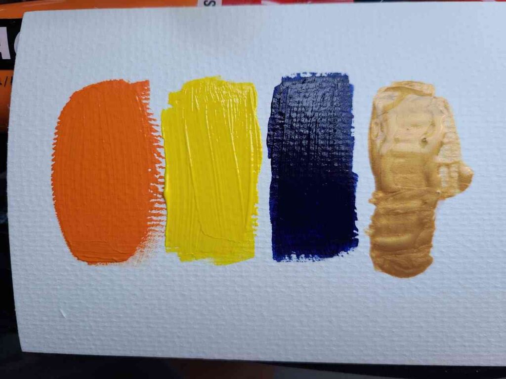
Dark color + light color + complementary color + metallic
Simple color scheme with 4 colors that works great for Dutch or dirty cup pours, but technically for any pours you like.
Examples can be dark navy blue, yellow, orange, gold, or copper metallic.
Classy Metallic color combo for fluid art
Black, white, gold, and bronze are very simple yet gorgeous color combos for pouring.
I used this premixed set for this color combination.
Tropical theme
Green, orange, yellow, and copper make a simple yet vibrant color palette for tropical pouring.
Red and violet also work great in tropical themes.
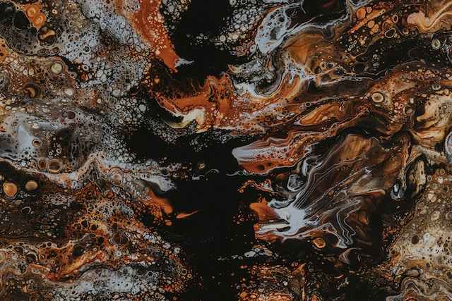
Earthy color palette
Earth-inspired color combinations are numerous, using brown shades, black, beige, white, copper metallic, yellow, and dark green.
Shine bright!
You can base your pour color palette mostly on metallic colors and then your pour painting will shine!
I used: metallic viridian, blue metallic, gold, silver, grey metallic, copper, and iridescent white.
This beautiful result was created with Hippie Crafter pour paints.
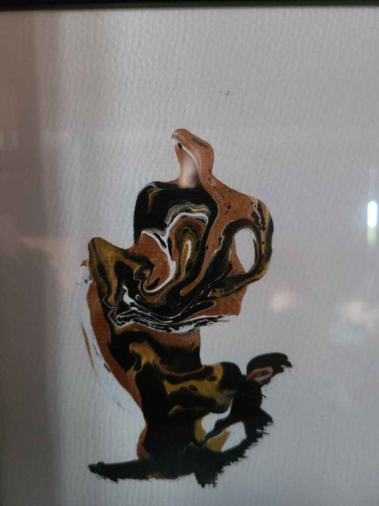
Marble-like
This pour doesn’t look exactly like marble but I’d like to give you an idea.
For marble pours we can use mostly black and white, or coral and white and grey but it can also have accents.
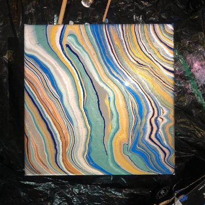
Pastel palette
The muted or neutral color looks amazing in pours.
Here is a photo I took one evening as I like these pastel, soft colors and the palette I can use to recreate this feeling in pour:
Barbie color combo for acrylic pouring
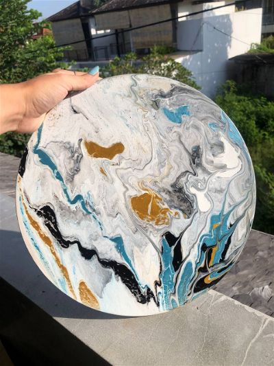
Sky & Ocean Palette
There are a few variations for ocean pours and sky pours:
- dark blue, sky blue, turquoise blue, turquoise green, white
- turquoise, dark blue, light blue, white, beige
Rainbow Pour
Easy to combine this pour color palette: red, orange, yellow, green, sky blue, dark blue, and violet.

You can do some variations to make your rainbow unique, for example:
- pastel rainbow
- warm/cool colors rainbow
I see it being perfect for string pours and ring pours but it is totally up to you!
Use Secondary Colors: Green and Purple
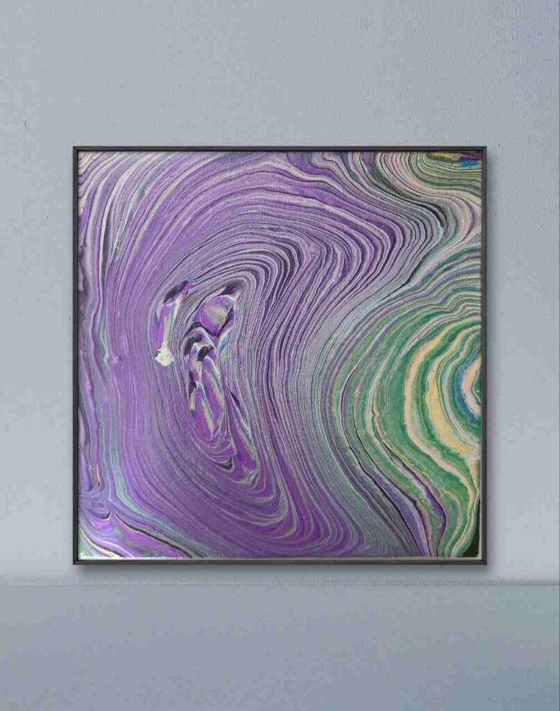
I created this ring pour with purple, green, yellow, silver, and silver played the role of a natural border between purple and green to make sure there was no mud.
I love ring pours because they are so hypnotizing.
Black, rose gold, gold, copper, white
A variation of a classy and chic pour palette – adding a different metallic color.
I used rose metallic and it creates an almost marble-looking effect.
For this pour, I used my go-to set of premixed pouring paint.
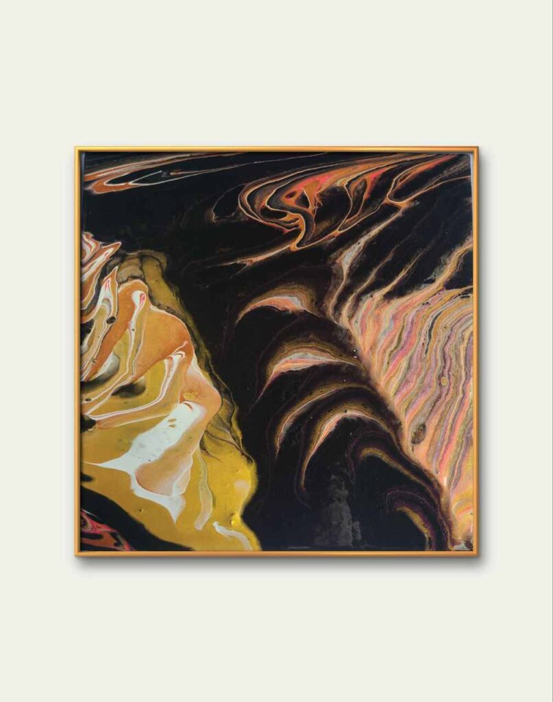
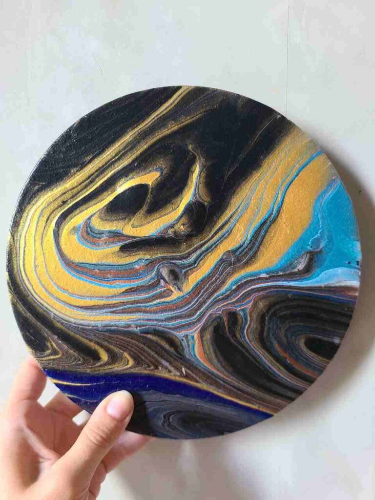
Bold contrast
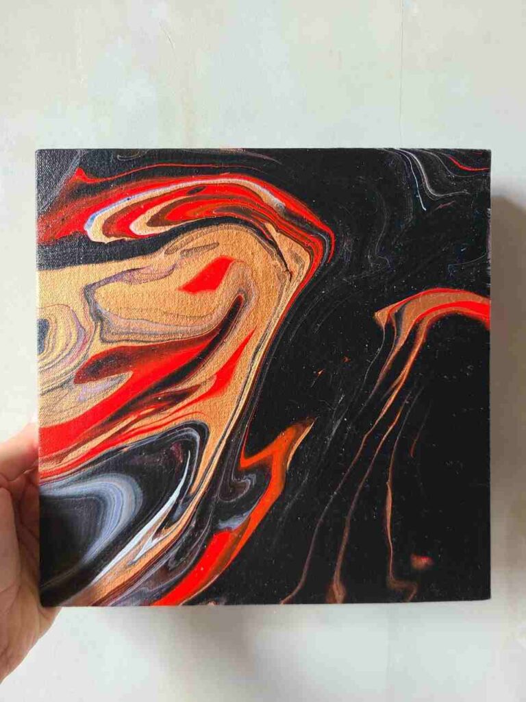
Black, red, gold, or bronze is another classic and bold palette.
Red is a very dominant color but it adds value when it is not overpowering other colors and doesn’t sit as a big blob on the canvas.
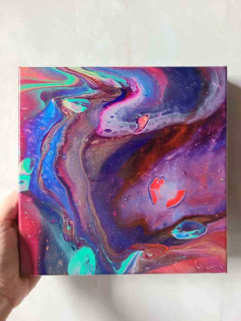
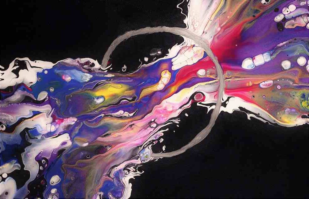
Galaxy Pour Colors Combination
The beauty of a galaxy palette is that it can have sooo many variations, but it leaves so much space for experiments.
I like using purple, pink, blue, turquoise green, metallic colors, and black to create that depth and unpredictability.
I used a balloon to lift some paint and create a visual effect of planets.
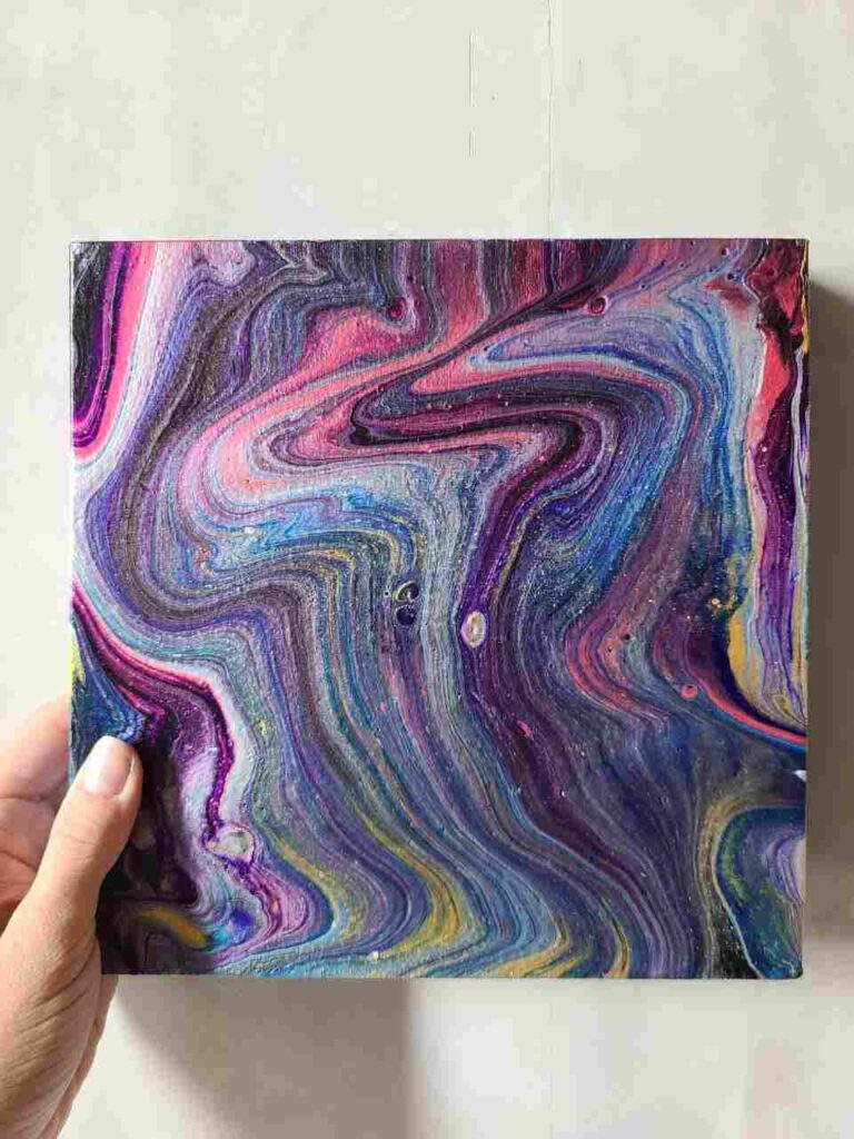
Psychodelic scheme
Psychedelic color schemes can be anything: I use silver, red, purple, magenta, blue, dark blue, yellow, and green.
Basic Pour Palette
The basic palette is using 3 primary colors in warm or cool shade or combining both.
For instance, here I took red and magenta (different temperatures of the same primary), yellow and blue.
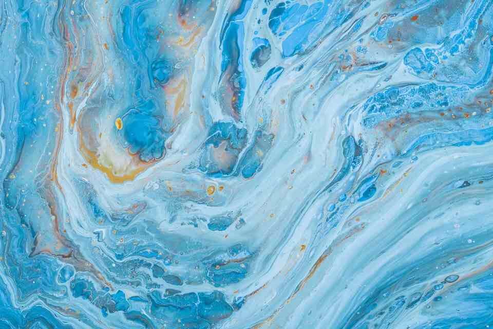
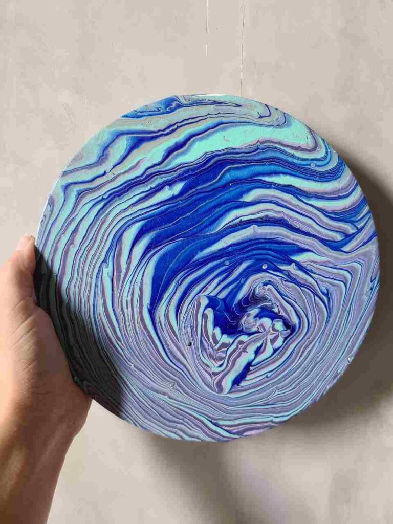
Sea & Ocean Inspired
The monochromatic scheme is the best for pouring ocean: dark blue, light blue, turquoise, and white.
I use silver instead of white sometimes or cool grey and it makes beautiful borders between blue shades.
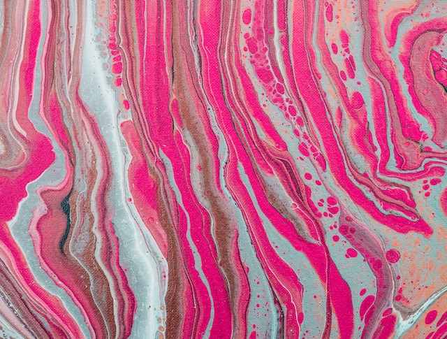
Dark colors + Light Colors
I love adding metallic colors for almost all pours.
The basic color combination for pouring is to combine dark colors and light colors, for ex., black, dark blue, sky blue, and yellow.
But I substituted yellow with gold to make it more interesting. What do you think?
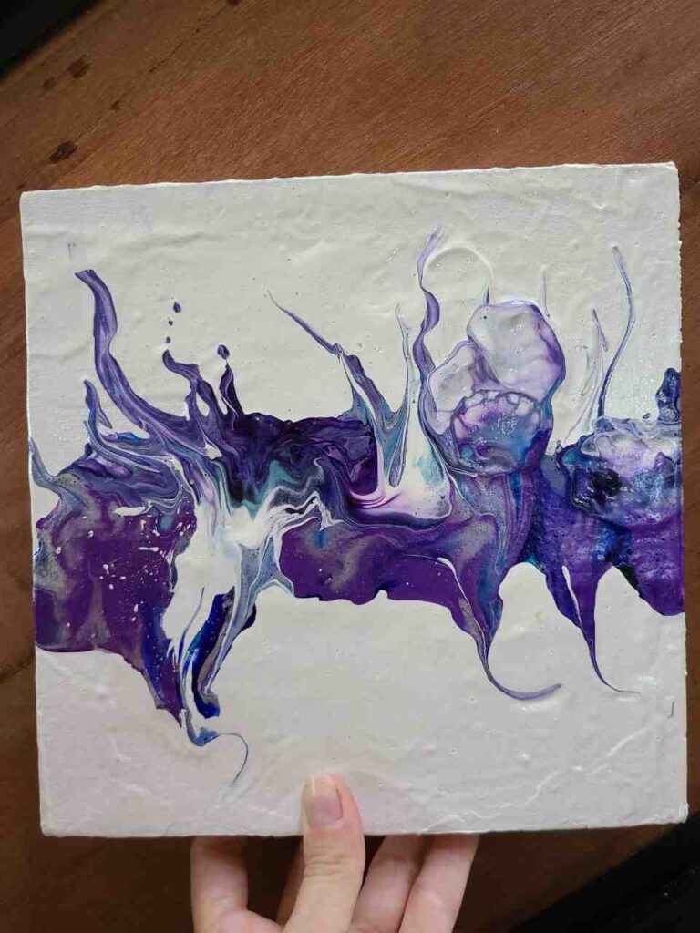
Analogous color combo for pouring
An analogous color palette is very easy to combine for a beginner: pick 3 colors that are next to each other on the color wheel!
Here I chose: darker blue, blue, and purple!
Monochromatic color scheme
To make a monochrome pour you need colors from the same family, like color shades of one color.
For ex., magenta, pink, baby pink, pale pink, and white.
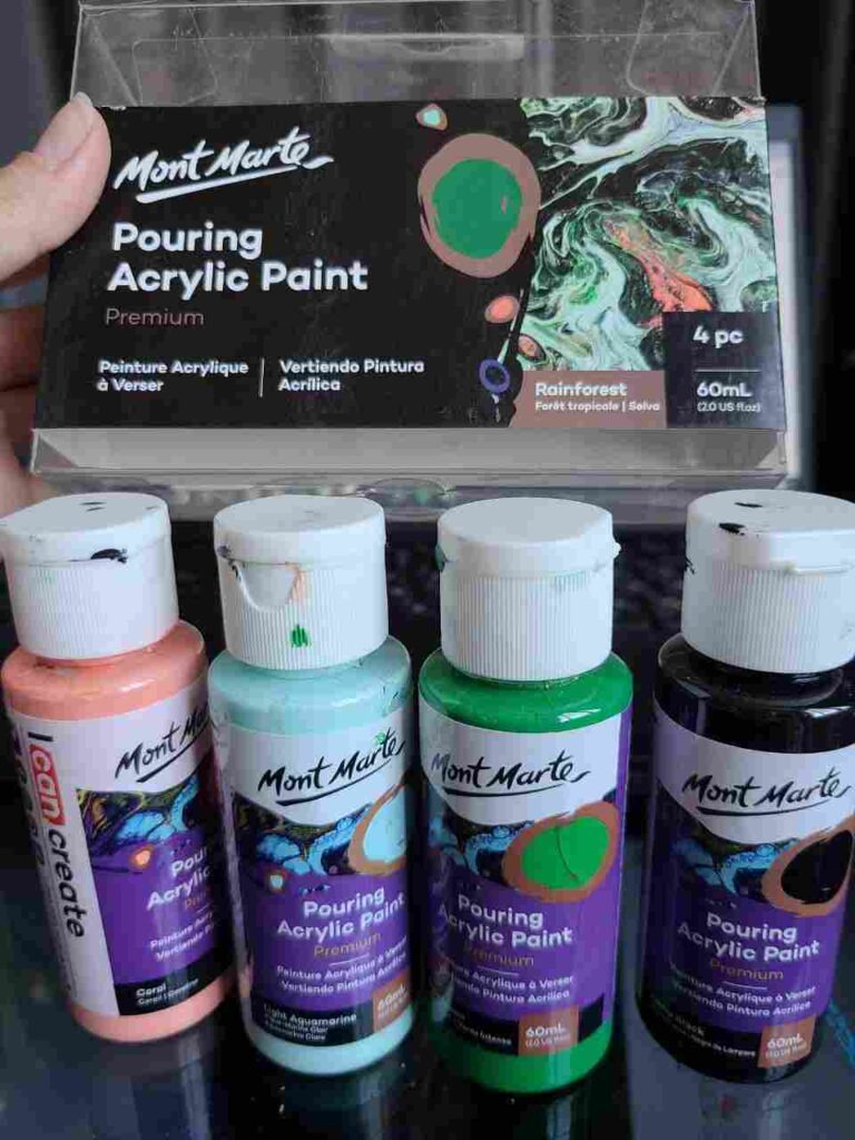
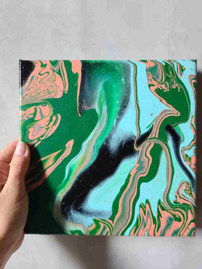
Rainforest Color Combo
I bought the Mont Marte pour paint set “Rainforest” which includes: black, dark green, light aquamarine, and coral.
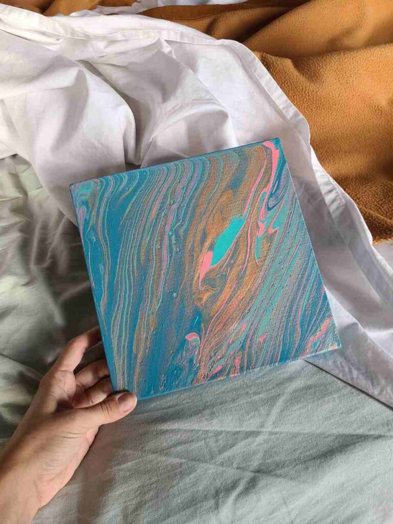
Calm Paint Pour Combo
I love bright colors but sometimes the mood dictates something more reserved.
I love this calming pour paint combination: turquoise, pink, gold, and blue.
All pastel colors and green also have calming and relaxing effects – perfect for the bedroom.
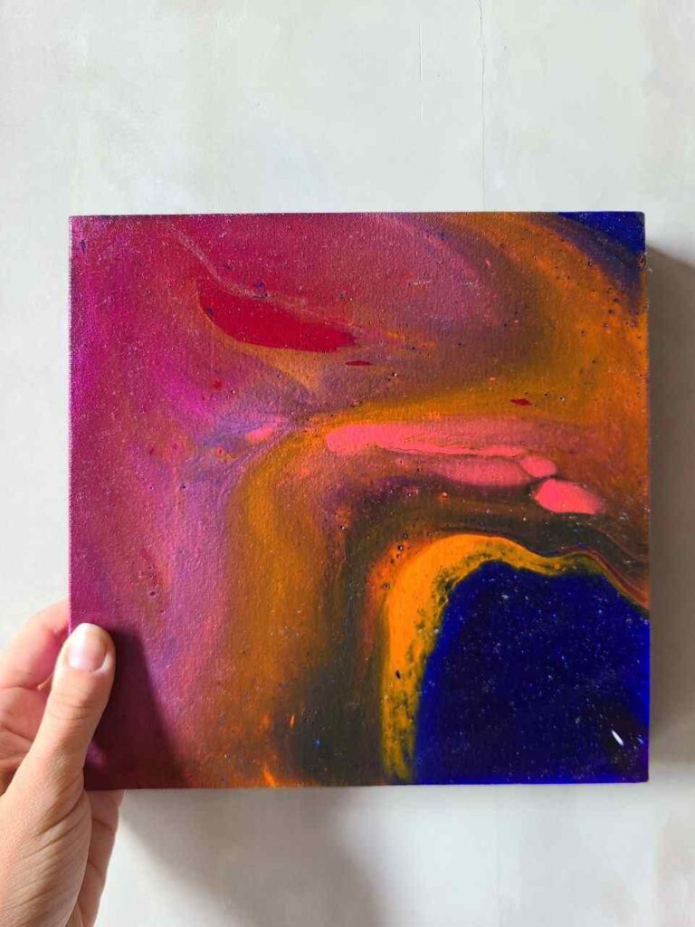
More Amazing Color Combination Ideas For Pouring:
- Universal: Dark color + light color + complementary color + metallic
- Analogous: dark blue, blue, green-blue
- Monochromatic: light blue, medium blue, and dark blue
- Vibrant and simple: blue, yellow, red and violet
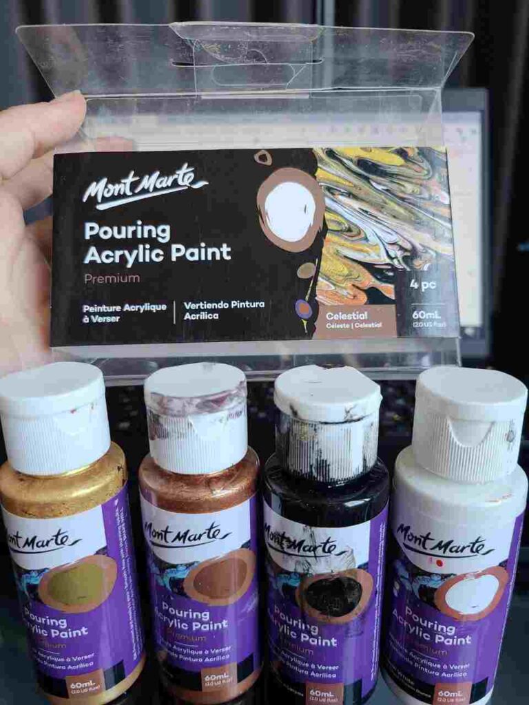
- Classy: Black, white, gold and bronze
- Stunning: yellow, turquoise, gold on navy pillow
- Bold: Black, red, gold or bronze
- Tropics: green, orange, yellow, copper
- Beach scene: dark blue, sky blue, white, turquoise blue, turquoise green, beige
- Ocean: dark blue, light blue, turquoise blue, turquoise green
- Classic or pastel rainbow pour
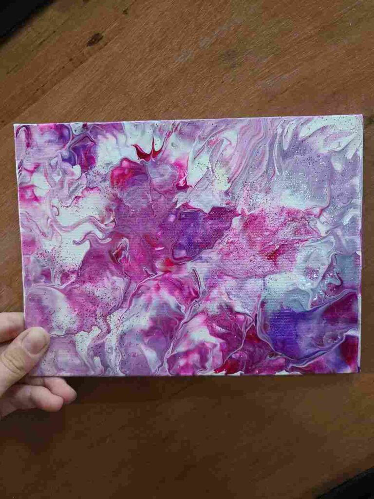
- Roses: red, pink, white, light olive green
- Pastel: pale violet, pale blue, pale pink, beige, white
- Galaxy: purple, blue, magenta, yellow, green, metallic colors, black
- Rainforest: black, aquamarine, coral, forest green
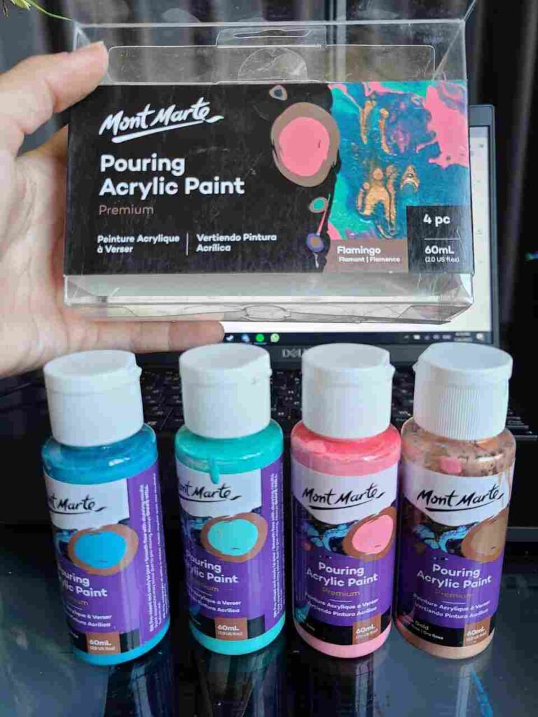
- Flamingo: Pink, Phthalo turquoise, turquoise, rose gold
- Dreamy: light purple, ultramarine, dark purple, mint green.
- burnt sienna, white, ultramarine, aqua blue – gorgeous for ring pours
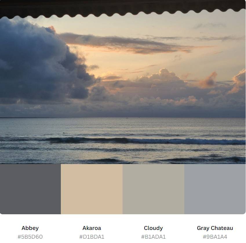
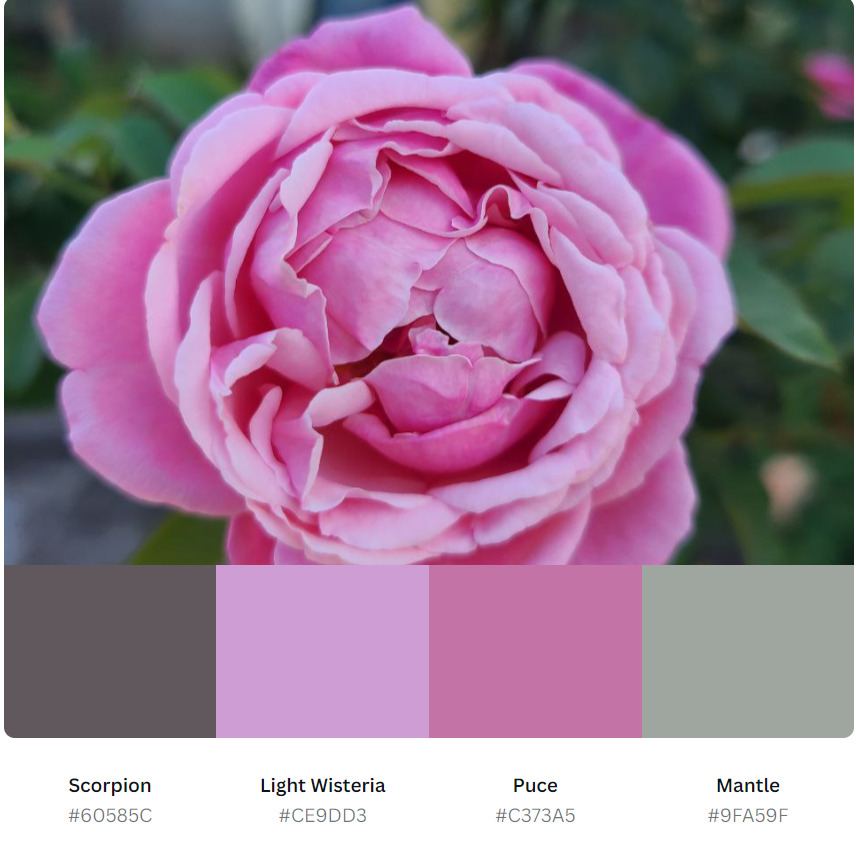
Pick Colors from a Photo
If you have a photo from the trip or you particularly like roses or hortensias you can take a photo and create a palette based on it.
It is simple and free – upload it to the Canva color palettes generator and get the exact colors you can use.
For ex., I have 9 types of roses (yes, I am addicted to roses), and here is one of my favorite roses and the color palette I can use to make a pouring inspired by this flower.
Use Premade Free Color Palettes
- Canva Color Palettes
- Trending color palettes by Coolors
- Some color palette ideas from Colorpalettes.net
The downside of all online and digital color palettes is that they give you a HEX code of the colors and not their paint names.
So it will be your turn then to figure out what paint will match that palette.
Final words
In conclusion, beautiful paint-pouring color combinations can be achieved by using mixing new colors and combining techniques.
By using complementary colors, analogous, monochromatic colors, or triadic colors, you can create a cohesive and visually pleasing color scheme.
Experimenting with different pouring techniques, such as the bloom or kiss cup, can also create unique and interesting patterns and textures.
The possibilities for paint-pouring color combinations are endless (and I’m not exaggerating), and with a little creativity and experimentation, you can create a stunning work of art that is uniquely yours.
Masha Eretnova, born in 1991, is a Chiang Mai-based certified teacher, artist, and blogger with 20+ years of personal painting journey.
She started painting and drawing very early and is now an international abstract artist and educator passionate about acrylic painting, gouache, and crafts.
Her works are part of international exhibitions and contests, including ArtlyMix (Brazil), Al-Tiba 9 (Spain), Exhibizone (Canada), Italy, and many more.
Besides her artistic pursuits, Masha holds a post-grad diploma in Teaching Film Photography and 2 music school diplomas: piano and opera singing.