Last Updated on December 17, 2025 by Masha Eretnova
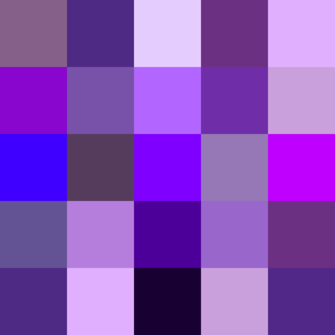
We used to picture the galaxy or the Milky Way in multiple mixed colors, and in most artworks or photos of it, it is like a war between two colors, violet vs purple.
However, it is a mystery what color is how to actually differentiate them, and if they are two different or the same colors at all?!
Purple is darker than violet and has more red in it, while violet is bluish and lighter. Violet and purple are not the same in nature but our eyes may not distinguish them.
Come on! Together, let’s explore violet vs purple, and in the end, surely you’ll be able to decide which color wins between violet and purple in your galaxy.
Table of Contents
Important Differences Between Purple and Violet [Summarized Upfront]
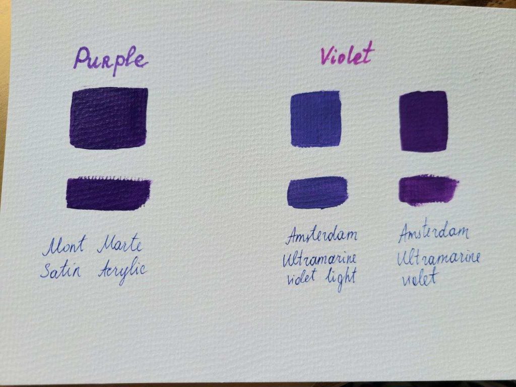
Violet vs purple at a glance doesn’t seem to make sense as the human brain perceives that both violet and purple are the same.
Broadening what we’ve revealed earlier, violet has its wavelength of light and is not between blue and red; purple, however, does not have its wavelength of light.
Whenever our eyes see a mixture of red and blue/violet light, it fools our brain and perceives it as purple. Although purple does exist in the art world, it does not exist in optics.
In addition, purple can be produced by mixing the colors red and blue; it has plenty of shades than violet.
Difference Between Purple and Violet:
| Violet | Purple |
| Violet is an actual color. | Purple is an artificial color produced by mixing two colors (red and blue). |
| Violet was considered a fundamental color in Isaac Newton’s color wheel. | Purple was not considered in Isaac Newton’s color wheel. |
| Violet is a color we can see in nature. | Purple is an artificial color produced by mixing two colors (red+blue). |
| Violet has around 90 shades. | Purple has numerous shades – around 140 shades. |
| Violet is less saturated and bluer. | Purple is more saturated and redder. |
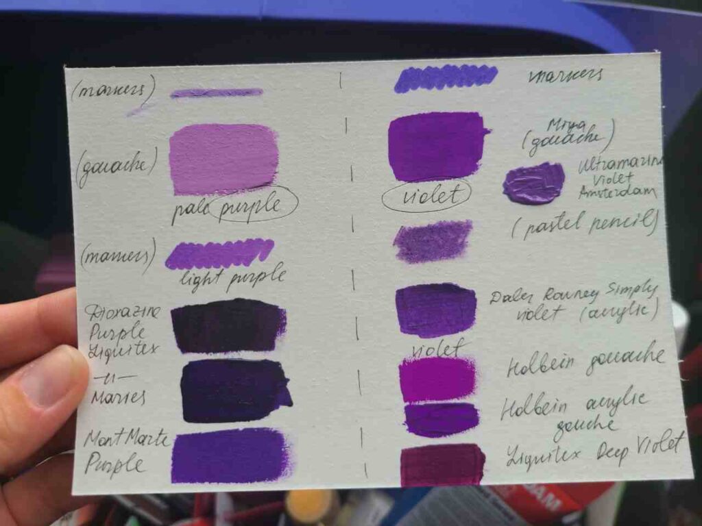
| Ex., Liquitex Deep Violet acrylic paint | Ex., Liquitex Deep Purple acrylic paint |
Even some brands name colors that look violet-purple and vice versa even today the market is confused :O
Read also: Best Acrylic Paint: 21 Brands Reviewed for Beginners [From Cheap to Pro]
Purple and Violet on the Color Wheel
The color wheel represents primary, secondary, and tertiary colors and reflects color theory and how colors interact.
Some color wheels include 12 colors, some include more.
So if a wheel includes only a limited number of colors, you will most likely see Purple there as a secondary color made of mixing red and blue. Violet won’t be there.
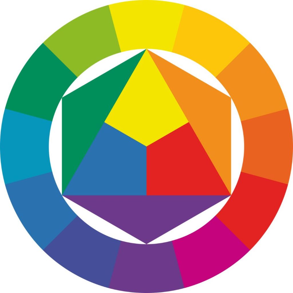
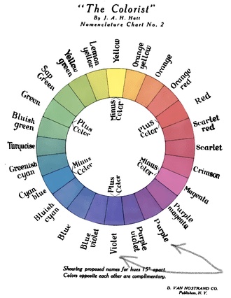
However, there are variations with more colors or a gradient-looking color wheel – they will contain both, purple and violet, and heading from red to blue, purple will go first as a color containing more red, followed by violet, as a color with more blue in it.
For ex., A 1908 color wheel:
Read more: How I Make Perfect Purple With Acrylic Paint
What is the violet color? Color that exists.
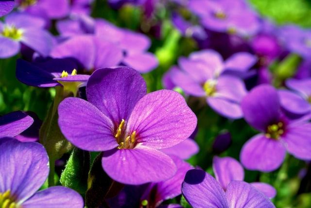
Violet is a spectral color included in one of the seven colors of a rainbow, or 1 of the seven colors that Isaac Newton named in 1672 when he was dividing the spectrum of light, visible light.
It was named based on a flower with the same name – violet!
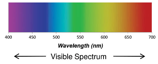
It is the light color of a short wavelength at the end – from 380 to 450 nanometers – of the visible spectrum between the invisible ultraviolet and blue.
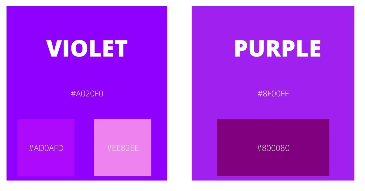
Violet is known as #8F00FF in hex code and is typically used for designing.
The violet color story goes way back in time.
Researchers who found prehistoric cave paintings say that indigenous people used violet dye. To make that traditional pigment they ground manganese and hematite.
There were actually more dyes and people seemed to love the violet-purple combination. One of the popular colors was Tyrian purple produced from different sea snail types across the globe or urchins.
What we see in nature – is violet. But when graphic designers need to reproduce this color on screens, they only can imitate it and thus it becomes closer to purple. The web violet is NOT the true violet this is why in digital there are so many different codes for violet and it can be confusing.
Some shades of violet:
- Bright Violet #ad0afd
- Cadmium Violet #7f3e98
- Grape #6f2da8
- Imperial #602f6b
- Pericallis Hybrida #904fef
- Lavender #b57Edc
- Periwinkle #8e82fe
- Violet Eggplant #991199
- African Violet #b085b7
- Indigo #4b0082
- Magenta Violet #553592
- Extraviolet #661188
- Heavy Violet #4f566c
- Violet Poison #8601bf
- Lavender Violet #767ba5
- Violet Eclipse #a387ac, etc
Read also: 7 Ways How to Make Acrylics More Opaque & Full Opaque Colors List
What is the color purple? The color we SEE
Purple is a non-spectral color, meaning it does not have its own wavelength of visible light. It is a product of blue and red wavelengths mix.
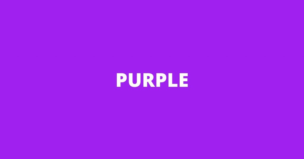
Purple has plenty of shades and usually sits between the colors red and blue. In designing, the hex code for purple is #A020F0 or #800080. Purple is typically the color we see after clicking links.
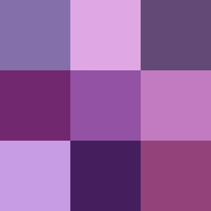
Some shades of purple:
- true purple #6A0DAD
- medium purple #9370DB
- pastel purple #C3B1E1
- thistle #D8BFD8
- plum #DDA0DD
- orchid #DA70D6
- fuchsia #FF00FF
- mauve #E0B0FF
- red purple #953553
Why can’t we trust our eyes?
We can’t trust our eyes because they can trick or deceive us.
We have special cells in our eyes that are responsive to color and light – cones that sit on our retina and give us our color vision.
We only have 3 types of cones – the majority are red cones, then green, and a few blue cones.
So every color we see will be just our cones processing input signals, all different wavelengths at once, and telling our brain what they think and can name as a color.
However, we rely on what we see almost always; researchers and scientists support this theory that our eyes can mislead or deceive us; this is also related to optical illusions.
- Our eyes look, but our brain sees
- When viewed with our eyes, shadows make the objects appear in a lighter color.
- The primary purpose of our eyes is not to make us see the exact color or something but to interpret what we see as efficiently as possible and to help us interact with our environment most appropriately.
- Neurological and biological differences affect how we see things.
Always remember that our eyes are influenced by the colors surrounding us; thus, they adapt colors.
What is the difference between violet and purple?

Although we have stated some significant differences between violet and purple earlier, we have prepared a list of their differences to get you more familiar with what color you’d like to see in your galaxy.
- Violet is a natural color while purple is a man-made color.
- Purple has more shades than violet. Violet is technically only one color, but in design also has shades.
- Violet is bluer, while purple is more of a red hue.
- Violet is a lighter color than purple.
- Purple is often mistakenly identified as violet. Even in English in the UK and US, they are often interchangeable, especially for people who are not in design or art.
Violet Vs Purple Vs Indigo Vs Magenta Vs Pink Vs Lilac Vs Blue
In addition to violet vs purple, in this part of the article, we will have a glimpse of the colors usually associated with violet and purple.
Indigo
Indigo is one of the many poorly defined colors; mostly, it is mistakenly labeled as “dark blue” or “blue violet.” Indigo sits between blue and violet, not only in rainbow colors; to make indigo, blue should be the dominant color.
The ratio should be 1:3 red and 2:3 blue to produce indigo.
You may check out these red and blue acrylic paints from Liquitex to produce a beautiful shade of Indigo or you may also try Winsor’s Indigo shade.
In RGB color space, indigo comprises 51% blue, 29.4% red, and 0% green while in CYMK color space, indigo comprises 100% magenta, 49% black, 42% cyan, and 0% black.
See the color conversion below for you to produce indigo well in design.
Color Conversion
The hexadecimal color #4B0082 has RGB values of R: 29.4, G: 0, B: 51, and CMYK values of C: 0.42, M: 1, Y: 0, K:0.49.
Magenta
Magenta, like purple, does not have its wavelength of visible light; however, it was part of Isaac Newton’s color wheel. Magenta is in the midst of red and blue, typically mistaken as violet or purple. The mixing ratio is 50:50, red and blue.
In RGB color space, magenta comprises 100% blue, 100% red, and 0% green, while CYMK color space shall consist of 100% magenta and 0% cyan, yellow, and black.
You may check out these red and blue acrylic paints from Liquitex to produce a beautiful shade of Magenta or check out Liquitex’s version of Magenta in a few shades.
See the color conversion below for you to produce magenta well in design.
Color Conversion
The hexadecimal color #FF00FF has RGB values of R: 100, G: 0, B: 100, and CMYK values of C: 0, M: 1, Y: 0, K:0.
Pink
Pink is known as a feminine color. It is a combination of red and white, basically pale red. Like purple and magenta, pink has multiple shades, but unlike them, pink is a distinct color and typically not poorly defined.
However, it would be best if you were careful when using blue to produce the color pink because having too much blue could make it turn purple rather than pink.
The safest ratio to get pink color is to use an equal balance of red and white, 50:50.
Playing with a white/red ratio you can create different shades of pink. You may check out these red and white acrylic paints from Liquitex to produce a beautiful shade of Pink or check out Liquitex’s versions of Pink.
In RGB color space, pink comprises 100% red, 79.6% blue, and 0% green, while in CYMK color space, pink shall consist of 25% magenta, 20% yellow, and 0% both cyan and black.
See the color conversion below for you to produce pink well in design.
Color Conversion
The hexadecimal color #FFC0CB has RGB values of R: 100, G: 75.3, B: 79.6, and CMYK values of C: 0, M: 0.25, Y: 0.2, and K:0.
Lilac
Lilac is a shade of purple, a pale shade of purple. It is mistakenly labeled as lavender, like violet vs purple.
To produce lilac, the ratio of red and blue should be 2:3, while blue and white should be 4:1.
You may check out these magenta, blue, and white acrylic paints from Liquitex to produce a beautiful shade of Lilac.
In RGB color space, lilac comprises 78.4% red and blue and 63.5% green, while in CYMK color space, 22% black, 19% magenta, and 0% cyan and yellow.
See the color conversion below for you to produce lilac well in design.
Color Conversion
The hexadecimal color #C8A2C8 has RGB values of R: 78.4, G: 63.5, B: 78.4, and CMYK values of C: 0, M: 0.19, Y: 0, K:0.22.
Blue
Blue is a cool color that usually represents the sky.
Blue is a primary color (also called cyan), meaning we can’t create blue from scratch. It has multiple shades, the product of when it is combined with other colors.
To play with shades of blue, you can add white to make the blue color lighter, or black or purple to make it darker.
You may check out these shades of Blue from Liquitex for your next project. The most common “blues” are Cobalt Blue, Cerulean Blue, Ultramarine Blue, and Sky Blue.
In RGB color space, blue comprises 0% red and green and 100% blue, while in CYMK color space, 100% cyan and magenta and 0% yellow and black.
See the color conversion below for you to produce a blue well in design.
Color Conversion
The hexadecimal color #0000FF has RGB values of R: 0, G: 0, B: 100, and CMYK values of C: 1, M: 1, Y: 0, K:0.
Read more: How To Mix Acrylic Paint? – Your Complete Color Mixing Guide
Purple vs Violet RGB
RGB color space means the color produced by three colored lights, Red, Green, and Blue.
Below is the RGB violet vs purple.

RGB color space is part of our everyday life.
The digital screens we use produce colored lights (RGB), which our eyes are more sensitive to. Although the color violet we see on digital screens is not the natural color, it increases the blue light to replicate it.
As for the purple, digital screens produce purple light by using red and blue light, with a higher amount of red light.
The main reasons digital screens use only RGB color space are convenience and cost-saving.
Read also:
Why do we say violet instead of purple?
We say violet instead of purple or vice versa because both colors are very similar to us humans. Sometimes, it can be because of culture or ethnicity.
Although by reaching this part of this article, I believe that it was clear how different violet and purple are, we can still have this confusion because, again, our eyes perceive these two colors (violet and purple) the same way.
It would only help to remember that violet is bluish, purple is reddish, violet is a unique color, and purple is a combination of two primary colors.
Violet color meaning
Violet is among the most famous hues associated with negative attributes like narcissism, hypersensitivity, and arrogance. Still, like any other, Violet’s positive traits are thoughtful, empathetic, intuitive, and wise, outshining those negative attributes.
Violet symbolizes spirituality, wisdom, and creativity. It has a motivating and inspiring effect; violet can uplift and balance the mood.
The Violet people are said to be self-sufficient, which sometimes makes them an introvert. They are contented people but spiritual, and they can rely on their strengths.
To sum up:
- narcissism, hypersensitivity, and arrogance
- thoughtful, empathetic, intuitive, and wise
- spirituality, wisdom, and creativity
Purple color meaning
Purple is a catchy color associated with royalty, leadership, and power.
It is also typically linked with mystery, imagination, and magic. Although purple encourages the suppression of emotion, it can also bring ideas and creativity. Like violet, it has a calming and uplifting effect.
The purple people are said to be artistic and have an intuitive side. They tend to have a great time in their world, imagining and living in their fantasy, leading them to be independent. They are also spiritual, and some consider themselves to have psychic abilities.
Purple, like violet, encourages love, empathy, and compassion.
To sum up:
- royalty, leadership, and power
- mystery, imagination, and magic
- artistic
- festivities: Lent, Easter, Mardi Gras
How can we use purple and violet in art?
Violet makes the perfect color for flowers, especially those that are naturally violet.
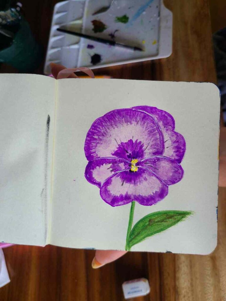
Both violet and purple play a role in color mixing, for ex.,
- yellow and purple mixed make brown
- green and purple make grey or dark blue, etc
And also for contrasts. Yellow objects pop on a purple background.
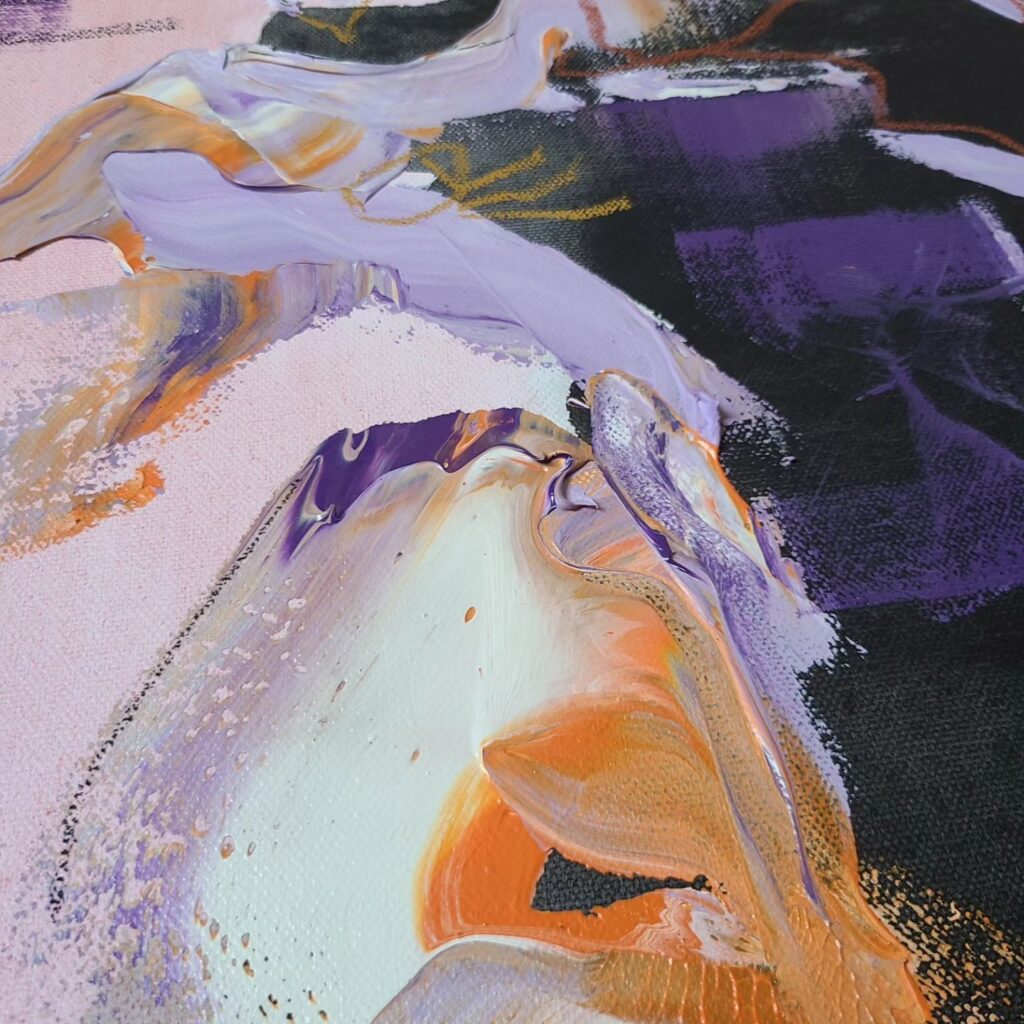
A detail of one of my works in 2023 – Amnesia. I used a lot of purple and mixed purple with white gesso.
Wrapping it up
Now that I know how different they are, it amazes me how our eyes process everything we see, and it makes me want to dive into the colors of our world.
How our eyes perceive the world and how we explain it in words or with our art is amazing!
If you’re to grab just one piece of information from my article, let’s know that it is totally normal to confuse them in paints, but if you really need to choose: purple is more red, and violet is more blue and pale.
What do you call this color most often? I have to say, my word of choice is purple! But I will be acting like an educated person 😉
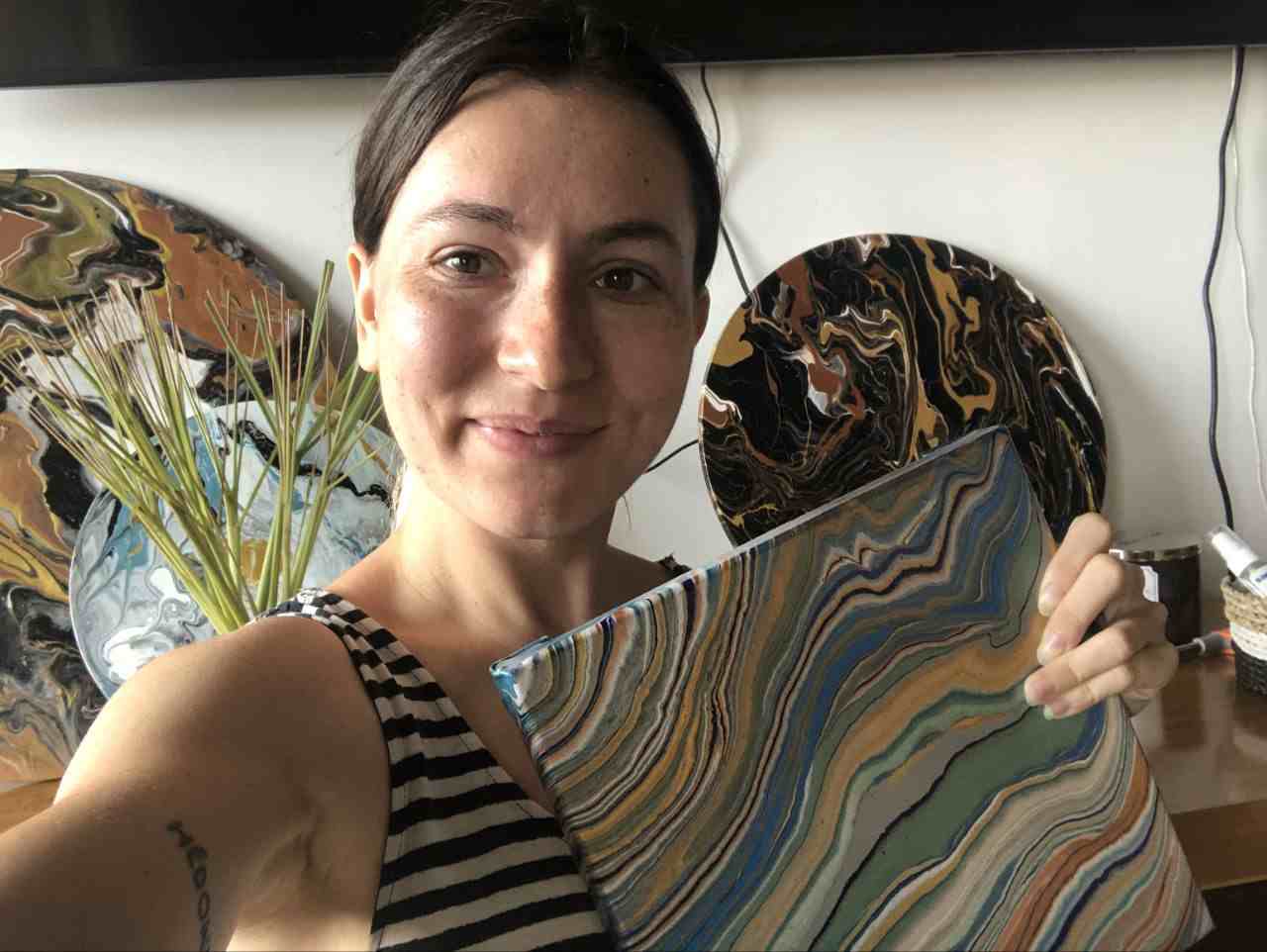
Masha Eretnova, born in 1991, is a Chiang Mai-based certified teacher, artist, and blogger with 20+ years of personal painting journey.
She started painting and drawing very early and is now an international abstract artist and educator passionate about acrylic painting, gouache, and crafts.
Her works are part of international exhibitions and contests, including ArtlyMix (Brazil), Al-Tiba 9 (Spain), Exhibizone (Canada), Italy, and many more.
Besides her artistic pursuits, Masha holds a post-grad diploma in Teaching Film Photography and 2 music school diplomas: piano and opera singing.
